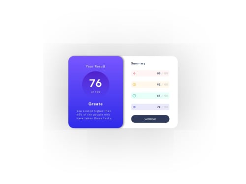
Not Found
Not Found
Not Found
Not Found
Not Found
Not Found
Not Found
Not Found
Not Found
Not Found
Not Found
Not Found
Not Found
Not Found
Not Found
Not Found
Not Found
Not Found
Not Found
Not Found
Desktop design screenshot for the Results summary component coding challenge

This is a solution for...

  • HTML
  • CSS
1newbie
View challenge

Design comparison


SolutionDesign

Solution retrospective


What are you most proud of, and what would you do differently next time?

Congratulations to me for completing this challenge This challenge was a little tricky but I did that.

I am proud, that I did this project, It has a lot of details in it, and I find that I solved those.

What challenges did you encounter, and how did you overcome them?

I was stuck a little to accessing the index of components that comes from data.json, but did that after searching a little on Google and MDN docs.

What specific areas of your project would you like help with?

I want improvements related to the border of every summary result, specifically in assigning borders at the edges of every summary, how can I implement that?

Community feedback

@KirativeWD

Posted

Hi there!

You asked how you can implement styling each summary result with a border.

Looking at your CSS, you currently have...

.items {
  border: 1px gray;
}

However, the shorthand for border requires a border-style which is an easy fix!

.items {
  border: 1px solid gray;
}

I hope this helps.

Happy coding!

0

@fayiz770

Posted

Thank you for helping however I mean:

How do you set the border on the box's corners, not the whole border? @KirativeWD

0

@KirativeWD

Posted

@fayiz770

Oooh, I see what you're asking now. The corner borders are so difficult to see; I didn't include them myself (lol).

This could be accomplished in a few ways, the easiest being with <div> elements that are absolutely positioned. However, this would require a lot more HTML and CSS so let's go with a solution I found on css-tip that I adapted for this solution and requires far less code.

For visual purposes, I adapted my GitHub repo (without the borders, though I may add them) to a CodePen with the borders. You can see it here: Frontend Mentor - Results Summary with Corner Borders

Depending on your layout, you may have to adapt what I have done, but first, we will look at the rendered HTML structure.

<li style="outline: 1px solid hsl(0, 30%, 90%);">
  <div class="inner" style="background: rgba(255, 87, 87, 0.1);">
    <div>
      <img>
      <h4>Reaction</h4>
    </div>
    <div>
      <span>
        <span>80 </span>
        <span aria-hidden="true">/</span>
        <span class="sr-only">out of </span>
        100</span>
     </div>
   </div>
</li>

I have a div (inner element) wrapped in an li (outer element). The outer element will be responsible for the corner borders while the inner element will be responsible for the styles needed for the design. I use inline styling for the outline color and background, but that's because they're applied dynamically through React (on my GitHub). Nonetheless, let's look at the CSS.

li { /* Outer element */
  mask:
    conic-gradient(at 16px 16px, hsla(0 0% 0% / 0) 75%, hsl(0 0% 0%) 0)
    0 0 / calc(100% - 16px) calc(100% - 16px),
    linear-gradient(hsl(0 0 0) 0 0) content-box;
  padding: 5px;
  outline-offset: -5px;
  border-radius: 1rem; /* needed for the rounded corners*/
}

Looking at the CSS, I'll go line by line to explain each property and value except for the border-radius because that's self-explanatory.

  mask:
    conic-gradient(at 16px 16px, hsla(0 0% 0% / 0) 75%, hsl(0 0% 0%) 0)
    0 0 / calc(100% - 16px) calc(100% - 16px),
    linear-gradient(hsl(0 0 0) 0 0) content-box;

This first line is intimidating to look at but it is the magic required for the corner borders (which are actually outlines). The mask uses two layers, a conic-gradient and a linear-gradient. To explain the conic-gradient, at 16px 16px is where the angle or center point at which the gradient rotates. If you visualize a square, it would be 16px from the left and top. hsla(0 0% 0% / 0) 75% is the gradient's first color stop and position. It essentially means that the first 75% of the gradient is transparent. hsl(0 0 0%) 0) is the gradient's second color stop and position and assigns the rest of the gradient with black. 0 0 / calc(100% - 16px) calc(100% - 16px) this last line of the conic-gradient specifies the position and size of the gradient. 0 0 places it in the top left and calc(100% - 16px) calc(100% - 16px) makes it so that it covers the entire element minus the 16px on the X and Y axis.

The linear-gradient is the easier one to understand (lol). (hsl(0 0 0) 0 0) content-box makes it so that a fully black gradient covers the entire content with content-box restricting it from going into the padding.

  padding: 1px;
  outline-offset: -1px;

The padding is the gap between the content and the outline. With the outline being the negative opposite of the padding, the corners become juuuuust visible due to the masking and border-radius.

Again, you may need to adapt this depending on your layout, but this is one way to create borders on just the corners of the summary scores.

Marked as helpful

1

@fayiz770

Posted

Thanks for helping, but still not working no idea. @KirativeWD

0

@KirativeWD

Posted

For it to work, the HTML structure needs an outer element for the border design and an inner element for the overall design. Your current structure (while it could be updated semantically) uses a single div.

You'll want to wrap .items in another div, perhaps with the class .border so you know what it's for, and apply the CSS above. But again, you may need to tinker with it to get proper results.

0

Please log in to post a comment

Log in with GitHub
Discord logo

Join our Discord community

Join thousands of Frontend Mentor community members taking the challenges, sharing resources, helping each other, and chatting about all things front-end!

Join our Discord