

Design comparison
SolutionDesign

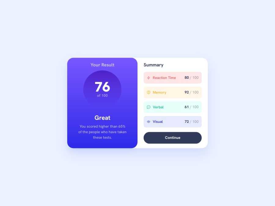
Solution retrospective
What are you most proud of, and what would you do differently next time?
I'm happy with how I structured the HTML in this one, and didn't shy away from going back and iterating when I moved from mobile to desktop styling to keep things orderly.
What challenges did you encounter, and how did you overcome them?Adding a smooth transition animation when hovering on the button was tricky - gradients don't transition smoothly, so I ended up adding a pseudo-element to get the smooth animation I was after.
Please log in to post a comment
Log in with GitHubCommunity feedback
No feedback yet. Be the first to give feedback on Theo Harris's solution.
Join our Discord community
Join thousands of Frontend Mentor community members taking the challenges, sharing resources, helping each other, and chatting about all things front-end!
Join our Discord