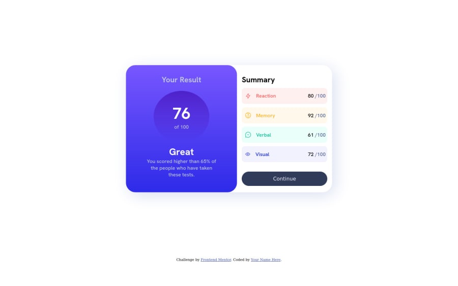
Not Found
Not Found
Not Found
Not Found
Not Found
Not Found
Not Found
Not Found
Not Found
Not Found
Not Found
Not Found
Not Found
Not Found
Not Found
Not Found
Not Found
Not Found
Not Found
Not Found

Submitted

Results Summary

@MatheusChrispim

Desktop design screenshot for the Results summary component coding challenge

This is a solution for...

  • HTML
  • CSS
1newbie
View challenge

Design comparison


SolutionDesign

Solution retrospective


The biggest and worst difficulty was making the layout responsive for mobile, where there were several selectors that needed to be modified, I wanted to check with everyone if it is possible to modify this in a more practical way, so that when working in a responsive way, many adjustments are not necessary in CSS components and selectors.

Community feedback

@Georgenico

Posted

Hi there, congratulation on finishing this project!

I have a little suggestion. you can try to put display: flex on the body itself like the way you did on the main, this way it will automatically adjust and always be on center based on your screen size and I think you forgot to add a cursor on your button. As for me, you did a great job, and I find it good.

display:flex
min-height: 100vh
justify-content: center
align-items: center

Marked as helpful

0

Isfaqul 330

@Isfaqul

Posted

Congratulations on completing this Challenge Matheus. You have done a good job of re-creating the desing.

I understand the problem you mention regarding the responsiveness of the design. I see a couple of problems in your code -

  1. Do not set your body to a fixed width, because it will remain fixed at that and will not automatically resize based on your screen size.
  2. Body height, should be a set as min-height : 100vh. So, that at minimum it is 100vh and it can expand if required.
  3. Setting the width of your main container as 45%. The 45% is set basd on the parents width. If the parent is 100px, main will be 45px, if it's smaller, it will get even smaller. Instead set a maximum width, so that the main container will get have a maximum width of let's say 800 pixel. When the screen size shrinks, it will shrink down if possible.

There are many others, but if you start here. I think you will have a good start. Keep learning, keep coding!

Marked as helpful

0

@MatheusChrispim

Posted

@Isfaqul Thanks for your big help! Your tip was enlightening and will help me in future projects.

0

Please log in to post a comment

Log in with GitHub
Discord logo

Join our Discord community

Join thousands of Frontend Mentor community members taking the challenges, sharing resources, helping each other, and chatting about all things front-end!

Join our Discord