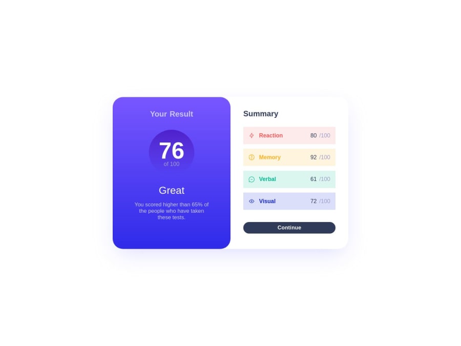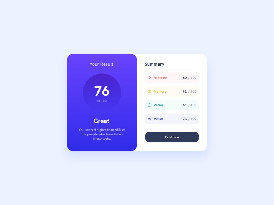
Design comparison
SolutionDesign
Solution retrospective
any feedback is okay
Community feedback
- @MelakuAlehegnPosted almost 2 years ago
Congratulations on finishing your project @jrdeveloper2 , Excellent job. I attempted to examine the mobile version of your design, and it appears that you have included some width that determines the length of the card on mobile devices. For mobile devices, the design's width remains narrower and to the left of the screen. Check the code you wrote for screen min-width: 720px. Specially this line of code
max-width: 46rem;0
Please log in to post a comment
Log in with GitHubJoin our Discord community
Join thousands of Frontend Mentor community members taking the challenges, sharing resources, helping each other, and chatting about all things front-end!
Join our Discord
