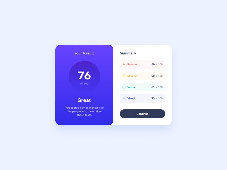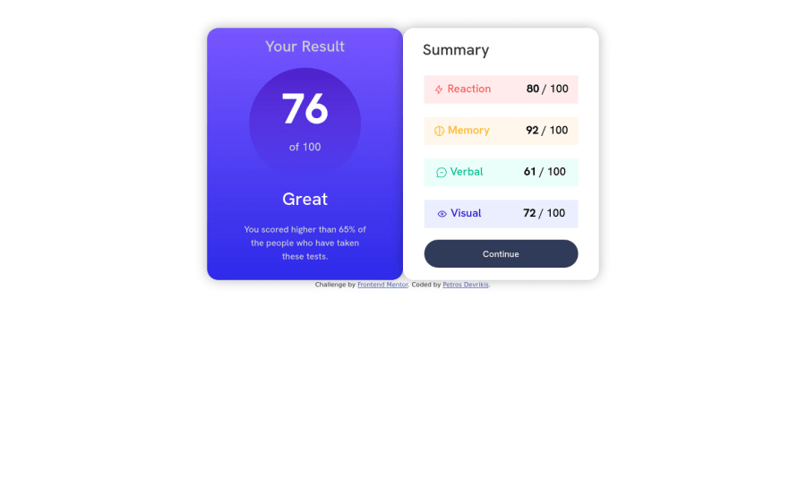
Design comparison
Solution retrospective
This is my solution for the Results Summary Component.
It was overall easy and enjoyable building this project, however I faced some difficulties regarding mobile responsiveness:
- I would like some feedback on how to synchronise icons and text in the Summary tables as well as how to lower
font-weight
on the percentagespan
.
I would appreciate your feedback and would like to receive your comments and perspectives regarding the project. Thanks a lot!
Community feedback
- @visualdennissPosted over 1 year ago
Hi there, nice work!
"how to synchronise icons and text in the Summary tables" ?
A quick fix is to set .skill { display: flex} and if u need a space between the icon and text, just add a gap: some-value in em/px.
Lowest you can go is 500 for that font-family since you have imported only these values: @import url("https://fonts.googleapis.com/css?family=Hanken+Grotesk:500,700,800"); Just pick lower values to include when importing if you wanna use too.
Hope you find this feedback helpful!
Marked as helpful0 - @0xabdulkhaliqPosted over 1 year ago
Hello there π. Congratulations on successfully completing the challenge! π
- I have other recommendations regarding your code that I believe will be of great interest to you.
HTML π·οΈ:
- This solution generates accessibility error reports, "All page content should be contained by landmarks" is due to
non-semantic
markup, which lack landmark for a webpage
- So fix it by replacing the
<div class="container">
element with the semantic element<main>
along with<div class="attribution">
into a<footer>
element in yourindex.html
file to improve accessibility and organization of your page.
- What is meant by landmark ?, They used to define major sections of your page instead of relying on generic elements like
<div>
or<span>
- They convey the structure of your page. For example, the
<main>
element should include all content directly related to the page's main idea, so there should only be one per page
HEADINGS β οΈ:
- This solution has generated accessibility error report due to skipping heading levels which warn us as "Heading levels should only increase by one"
- We want to avoid skipping heading levels, make sure to start with
<h1>
and working your way down the heading levels (<h2>
,<h3>
, etc.) helps ensure that our document has a clear and consistent hierarchy. Read more π
- Because skipping heading levels is a poor practice from the perspective of information design, whether we are talking about web pages, books, journal articles, or about anything else. You can not only confuse screen readers but all readers when you don't follow a consistent, logical pattern with your heading structure.
CSS π¨:
- let me explain, How you can easily center the component.
- We don't need to use
margin
andpadding
to center the component both horizontally & vertically. Because usingmargin
orpadding
will not dynamical centers our component at all states
- To properly center the component in the page, you should use
Flexbox
orGrid
layout. You can read more about centering in CSS here π.
- For this demonstration we use css
Grid
to center the component
body { min-height: 100vh; display: grid; place-items: center; margin: 0; }
- Now remove these styles, after removing you can able to see the changes
.container { margin-right: auto; margin-left: auto; }
.
I hope you find this helpful π Above all, the solution you submitted is great !
Happy coding!
0
Please log in to post a comment
Log in with GitHubJoin our Discord community
Join thousands of Frontend Mentor community members taking the challenges, sharing resources, helping each other, and chatting about all things front-end!
Join our Discord