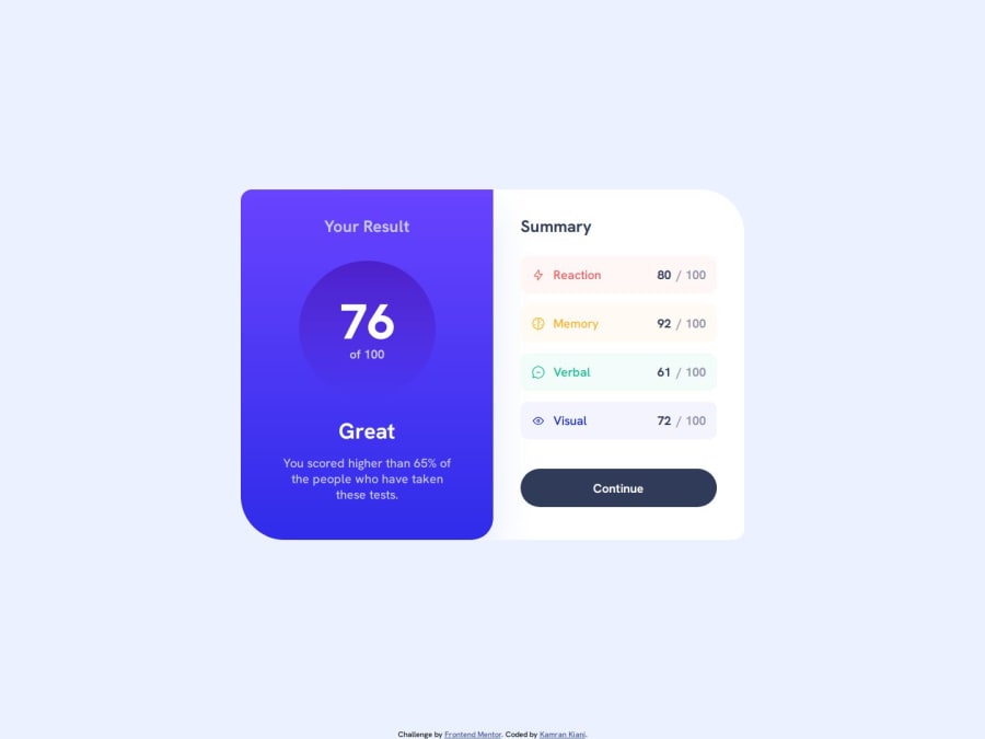
Design comparison
Solution retrospective
Please leave a comment for me, give me feedback, and tell me my mistakes.
Community feedback
- @tatasadiPosted 12 months ago
Hey Kamran,
First of all, great job on completing the challenge! It's evident that you've put a lot of effort into this project, and it's really paid off in the quality of your work. Your design looks clean and the functionality seems to be spot on. I especially appreciate the attention to detail you've shown in the layout and styling.
I do have a couple of small suggestions that might enhance your project even further:
Card Design Enhancement: Consider adding a border-radius and a box-shadow to your card. This could give it a more polished and modern look. The border-radius can soften the edges, making the card more visually appealing, while a box-shadow can add depth, making your card stand out more against the background.
Body Height Adjustment: Instead of using a height of 100% on the
bodytag, try using amin-heightof 100vh. This will ensure that your main container always fills at least the full height of the viewport, which can be particularly beneficial for shorter content pages. This approach provides a more consistent and visually appealing experience across different devices and screen sizes.These are just small tweaks, but they can have a significant impact on the overall user experience and aesthetic of your project. Keep up the great work, and I'm looking forward to seeing your future projects!
Marked as helpful0
Please log in to post a comment
Log in with GitHubJoin our Discord community
Join thousands of Frontend Mentor community members taking the challenges, sharing resources, helping each other, and chatting about all things front-end!
Join our Discord
