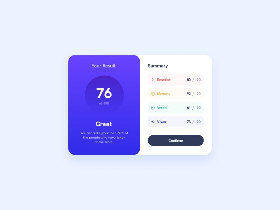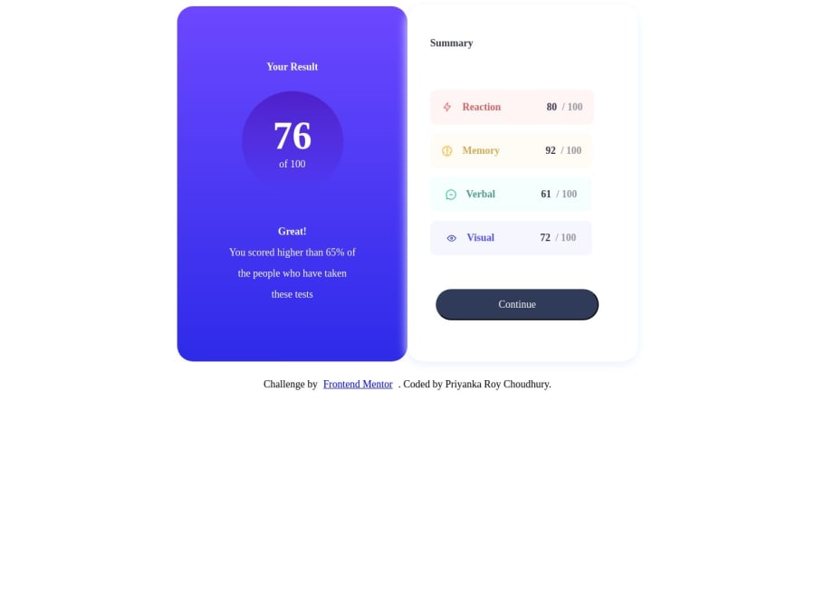
Results Component using HTML and CSS (2nd iteration)
Design comparison
Solution retrospective
Hi everyone!
I have iterated and worked on my second version of the results component page.
Any feedback will be appreciated!
Thanks
Community feedback
- @Catalina-HasnasPosted about 1 year ago
Hello, Priyanka Roy Choudhury!
I notice you use fixed pixel values for width, height, padding and gap on both card elements. I would encourage you try and find a way to have container size be more automatic. It looks alright on a big screen, but it's not responsive as you change sizes. It is also quite a lot of css code.
Try removing the width, height, padding and gap on both card elements. Also, remove the align-items: flex-end. You will see the flex container and the space that the flex items take up by themselves. You can start adjusting from there :). You might find that a
min-width
for the containers is enough. Since the two elements are inside a flex container, the height of one will depend on the height of another. And the height of one depends on the content inside it.The mobile designs are 375px, but in the deployed solution that screen size doesn't seem to be supported. This is, in part, due to large values of width/ height and padding, so start from that.
Good luck!
Marked as helpful0
Please log in to post a comment
Log in with GitHubJoin our Discord community
Join thousands of Frontend Mentor community members taking the challenges, sharing resources, helping each other, and chatting about all things front-end!
Join our Discord