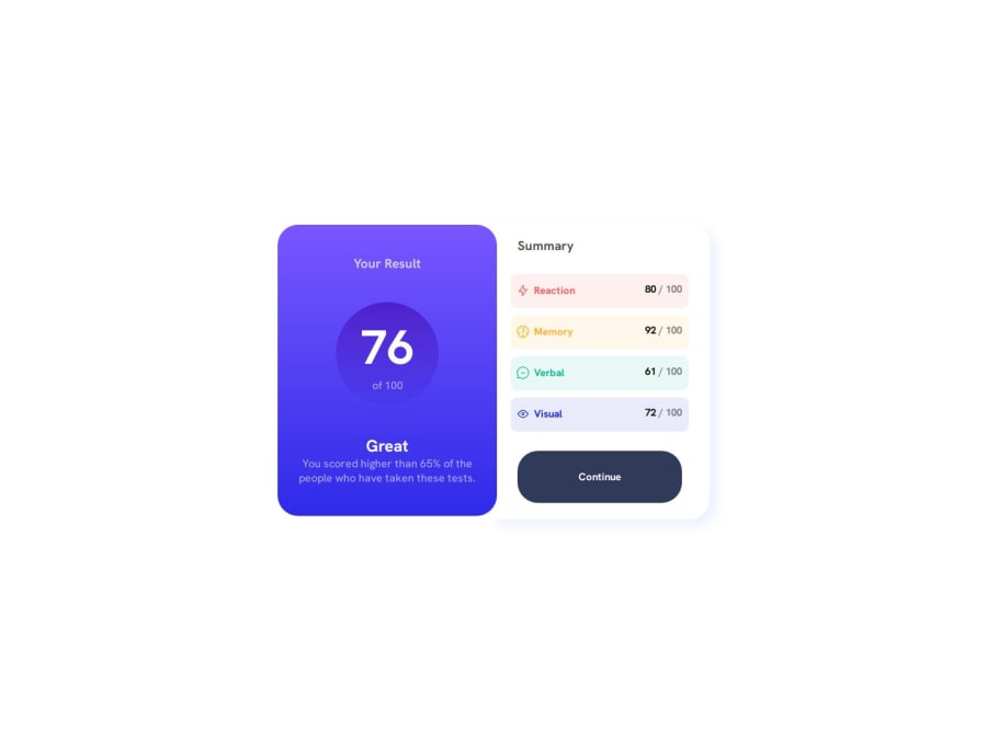
Design comparison
Solution retrospective
I'm very proud of the part where I used flex box and learn about the flex box properties such as flex, directions, justify content, etc.
What challenges did you encounter, and how did you overcome them?I encountered many errors during making this project and they're all still a few bugs which I am still working on and this needs more fixing and I still need more practice more projects like this.
What specific areas of your project would you like help with?I would really like help with the part at the end where when you make a responsive and the both of the divs overlap each other I did in a very bad way. I think there is a better solution because I used position absolute and added like lots of margins, which I think is not the right way to go, and I would really want to improve that and learn more about how I can tackle, that type of issue in the future.
Community feedback
Please log in to post a comment
Log in with GitHubJoin our Discord community
Join thousands of Frontend Mentor community members taking the challenges, sharing resources, helping each other, and chatting about all things front-end!
Join our Discord
