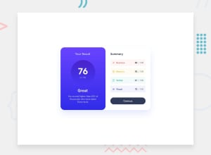
Design comparison
Solution retrospective
I completed this frontend mentor challenge result summary card component. you can my solution here. Any suggestions on how i can improve are welcome.
Community feedback
- @mikestopcontinuesPosted 11 months ago
Hey, this is a great start. I would dip back into this project and give it a few more revisions. Designers and product managers are very picky about their work. They expect you to match their designs nearly pixel-for-pixel.
When working from a design, I like to go from the outside in. Focus on getting the side of the largest container to work like the design first, then drill down and work on the inner sections.
In this case, I notice a few things about your outer box:
- It doesn't have the same
box-shadowas in the design. - It doesn't shrink when the browser window shrinks.
After that, take a look at the left area. Use a color picker to select the top and bottom color of the gradient to create your own matching
linear-gradient(). Then focus on the text size.Similarly, take the right area piece by piece.
If anything is unfamiliar, remember that the MDN docs on CSS are really awesome.
Keep going!
0 - It doesn't have the same
Please log in to post a comment
Log in with GitHubJoin our Discord community
Join thousands of Frontend Mentor community members taking the challenges, sharing resources, helping each other, and chatting about all things front-end!
Join our Discord
