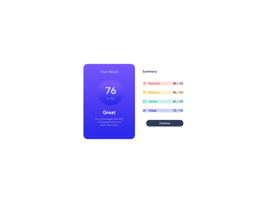
Design comparison
Solution retrospective
this is not responsive and my code isn't clean nor dry any advice would help thanks :)
Community feedback
- @lorenzoanielPosted over 1 year ago
Hey meursualt88 its okay as long as you are learning, a few pointers:
for DRY code, and I am basing this off of your tech stack of html and css:
- take a look at importing in css, this way you can have one 'main' css file and have several other smaller css files that you import into the main file (you can then just have this main file in your header element), this could also help if you have commonly used styling like center-ing an element.
- you can also have a seperate css file for css variables
For responsive css you already have a basic grasp of grid and flexbox, a good way to go about developing designs is to start with the mobile version first, this will be your base css style then work your way up the bigger resolutions, as you go up in resolution you will be using media-queries (I urge you to look into container-queries) and you can add the styling for that specific resolution (keep in mind this will be easier to do if you have seperate css files for each component/section), this way it is easy to keep track of different break point styling.
Good luck with your front-end journey
0
Please log in to post a comment
Log in with GitHubJoin our Discord community
Join thousands of Frontend Mentor community members taking the challenges, sharing resources, helping each other, and chatting about all things front-end!
Join our Discord