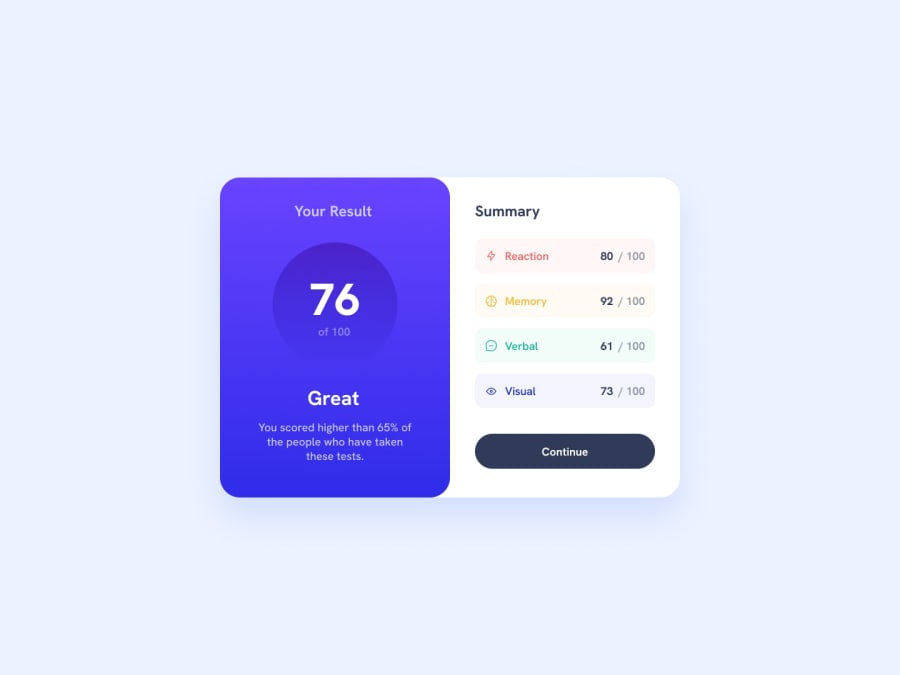
Result Summary page with flexbox and media query for responsiveness
Design comparison
Solution retrospective
I'd love to know how to perfectly use the background-image gradient property to make it look just like the project. Especially for the circular button holding the result. And also on how to decide whether the main or the body should be a flex.
I'd love any advice also to better deal with problems in the code.
Community feedback
- @lastirokoPosted over 1 year ago
For the gradient use linear gradient. Like this:
background-image: linear-gradient(hsl(252, 100%, 67%), hsl(241, 81%, 54%));
(edit with the right colors) Linear gradient colors goes from top to bottom firstColor = top, secondColor = bottom
The main body can and can also be a grid but to get that format with a grid you have to set grid to:
grid-template-columns: 1fr 1fr;
but make sure you nest the two sections in one div and target that div giving it a grid and the grid-template-columns with the value above. You can also use bootstrap rows and cols.
Lastly if the gradients are right you don't need to make the score circle fade.
Marked as helpful0@apah-devPosted over 1 year ago@lastiroko thanks for the reply. I'll try out the background-image gradient again. I did make the body a grid initially but i somehow reverted to a flex which worked fine especially with my media query. i'll test out the grid option as a personal challenge and see how it goes. thanks once again
1 - @apah-devPosted over 1 year ago
I'd also love to know how the made the button with the result fade along the border at the bottom
0
Please log in to post a comment
Log in with GitHubJoin our Discord community
Join thousands of Frontend Mentor community members taking the challenges, sharing resources, helping each other, and chatting about all things front-end!
Join our Discord