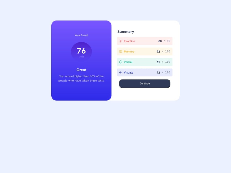
Design comparison
Solution retrospective
Doing this challenge I used tables for the result summary. Is it a bad Idea, because I saw others using divs? Any contribution will be appreciated.
Community feedback
- @DouooPosted about 1 year ago
Hi there Paul, this looks like a great start, and I think your code works fine. But I'm not sure why you went with table instead of div for this specific challenge but I take it, you've your own reason. However, I do suggest that you use unordered list <ul> for the layout instead of a table as I believe its semantically wrong. According to MDN documentation, the <table> HTML element represents tabular data — that is, information presented in a two-dimensional table comprised of rows and columns of cells containing data. More info here.
You might also need to adjust the typography of the following element:
- Your result (on the left side of the card)
- of 100 (under the score - its too small)
Lastly, you might reduce the border radius on the button and also add a
:hoverproperty on it. Additional to this, addcursor: pointeron it as well.0
Please log in to post a comment
Log in with GitHubJoin our Discord community
Join thousands of Frontend Mentor community members taking the challenges, sharing resources, helping each other, and chatting about all things front-end!
Join our Discord
