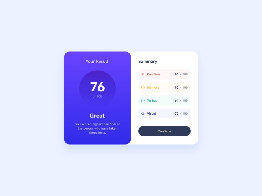
Design comparison
Solution retrospective
I did it. And I'm cool. But. I tried use an OOCSS naming convention and I'm not quite happy with the result. Maybe it's because I didn't catch the main idea, or maybe because this approach doesn't really fit there. Guess I should look for more examples.
I still leave the tag for people, who familiar with this convention, could come here and yell to me about what I did wrong.
What challenges did you encounter, and how did you overcome them?I tried to animate progress bars for summary content and had to use pseudo-elements for this. This in turn required add more custom css properties to manipulate those pseudo-elements via JS. But I'm glad with the result.
What specific areas of your project would you like help with?Open for any suggestions =)
Community feedback
- @MH-RashidPosted 10 months ago
Wow, this is amazing. I love that you really made this project your own with the animations and JS. The animations and gradients are spot on. Great responsive design for the viewport width, though I would suggest also adding a min-height condition so that you switch to back to mobile view once the window shrinks to the height of the card. The attention to detail is exemplary. Keep it up, brother!
Marked as helpful1@Alex-Archer-IPosted 10 months ago@MH-Rashid
Thank you! I love to fiddle with animations, transitions and stuff =)
Yeah, I notices when looked at the result from phone, that at least half of second section falls outside the screen. Kinda sad to make all this stuff for mobile users couldn't see it =)
And I totally forgot that
mediahavemin-heightparament! Guess I should think about how to change design. Gotta push it in my never-ending to-do list =)Anyway, thanks again! =)
1
Please log in to post a comment
Log in with GitHubJoin our Discord community
Join thousands of Frontend Mentor community members taking the challenges, sharing resources, helping each other, and chatting about all things front-end!
Join our Discord
