Design comparison
SolutionDesign
Community feedback
- @JordanMartinWebDevPosted about 1 year ago
Hey amine,
2 things I noticed when looking at your design.
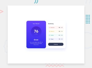
First, the alignment of "Summary" and "Your Results." In the original design they were lined up horizontally. In your design, there is a clear drop in the height of the word Summary on the right side.
Second, the right side results area you didn't use the colors provided in the ReadMe for the background. This may have been an aesthetic choice on your part, I don't know. But if you set the background colors to the same as the text colors, then lower the opacity, you'll get the same effect as what's in the design.
0
Please log in to post a comment
Log in with GitHubJoin our Discord community
Join thousands of Frontend Mentor community members taking the challenges, sharing resources, helping each other, and chatting about all things front-end!
Join our Discord
