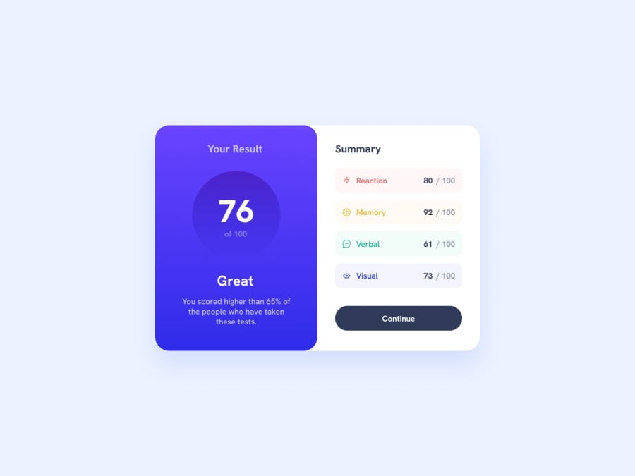
Design comparison
Solution retrospective
I'm very happy about the overall results. I took a huge inspiration from Kevin Powell's video (here the video).
After my first personal iteration I saw how he approached the challenge and I was so amazed how simply he broke down every layout piece. Kudos to him!
Also, I gave a shot to ES6 Javascript Classes to dynamically render the data in the json file.
Next time I'll for sure take more time to break down the layout as Kevin did.
What challenges did you encounter, and how did you overcome them?For me the challenge was to semantically lay down the HTML structure, but Kevin's video helped with that.
What specific areas of your project would you like help with?Something in particular I want an advice would be about the javascript part, but any suggestion is highly appreciated! :)
Community feedback
- @MahmoodHashemPosted 10 months ago
Your project appears to be very well-designed and responsive, and there are no issues with it. However, I have a suggestion to make your project more closely resemble the challenge. You can achieve this by adding rounded corners to the inputs using the
maskproperty in CSS. It's quite simple - just add a.class-nameclass to the inputs container and include the following code in your CSS:.class-name{ --size: 20px; border: 2px solid #b3818444; background: #f2f2f2 content-box; mask: conic-gradient(#000 0 0) content-box, conic-gradient(at var(--size) var(--size), #0000 75%, #000 0) 0 0 / calc(100% - var(--size)) calc(100% - var(--size)); }Marked as helpful1
Please log in to post a comment
Log in with GitHubJoin our Discord community
Join thousands of Frontend Mentor community members taking the challenges, sharing resources, helping each other, and chatting about all things front-end!
Join our Discord
