Not Found
Not Found
Not Found
Request path contains unescaped characters
Not Found
Not Found
Not Found
Not Found
Not Found
Not Found
Not Found
Not Found
Not Found
Not Found
Not Found
Not Found
Not Found
Not Found
Not Found

Submitted

Result summary component

@tdnguyen04

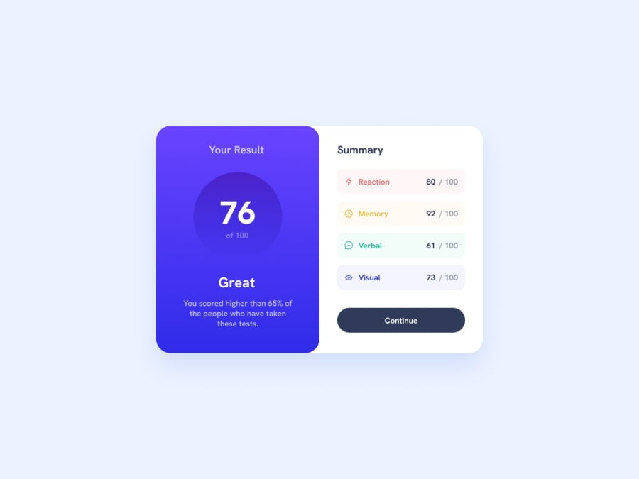
Desktop design screenshot for the Results summary component coding challenge

This is a solution for...

  • HTML
  • CSS
1newbie
View challenge

Design comparison


SolutionDesign

Solution retrospective


I am finding new way to add shadow to the second box. Currently, if I add box-shadow it won't work because flexbox design makes the box's height = 100vh, leading to a weird shadow (looks like a frame)

Also, I hope there is a way that I can manipulate the background of the first box. The original design looks better with contrast in different places. I feel like there is better way to manipulate the color, but I just try to decrease or increase color range manually, which looks not as close as the original design.

Community feedback

Daniel 🛸 44,230

@danielmrz-dev

Posted

Hello @tdnguyen04!

Your project looks great!

I noticed that you used margin to center the card vertically. SInce you added display flex to it, all you had to do was to also add align-items: center;, like this:

  • Apply this to the body (in order to work properly, don't use position or margins):
body {
    min-height: 100vh;
    display: flex;
    justify-content: center;
    align-items: center;
}

I hope it helps!

Other than that, great job!

Marked as helpful

0

@tdnguyen04

Posted

@danielmrz-dev Wow you are right. I couldn't remember why I didn't do that. I have made it right for the horizon. Thanks! :)

0

@tenze21

Posted

why don't you try decreasing the opacity of the colors I think that's what is setting your solution off from the original design.

0

@tdnguyen04

Posted

@tenze21 Oh I will. That makes sense. However, I am not trying to match all the color, but more of finding how to achieve the effect of blending between the circle, so that the upper part will have lighter color than the lower one. Have any ideas about that?

0

@tenze21

Posted

@tdnguyen04 Try using a linear-gradient as the background of the score-circle class, .score-circle{ background: linear-gradient(hsla(256, 72%, 46%, 1), hsla(241, 72%, 46%, 0));}

  • why don't you go for a mobile-first approach because that's what most of the people at frontend mentor are recommending. I have also received a lot of comments telling me to go for the mobile first approach.
  • another thing is they don't recommend setting font-sizes in px you should either use rem/em for further information on this you can go through Why font-size must NEVER be in pixels - FED Mentor

Marked as helpful

0

@tdnguyen04

Posted

@tenze21 Omg. Your comment is gold to me. I have not heard about such things. I appreciate it, Tenzin!

0

@tenze21

Posted

@tdnguyen04 No worries, I am also just a newbie ✌️

0

Please log in to post a comment

Log in with GitHub
Discord logo

Join our Discord community

Join thousands of Frontend Mentor community members taking the challenges, sharing resources, helping each other, and chatting about all things front-end!

Join our Discord