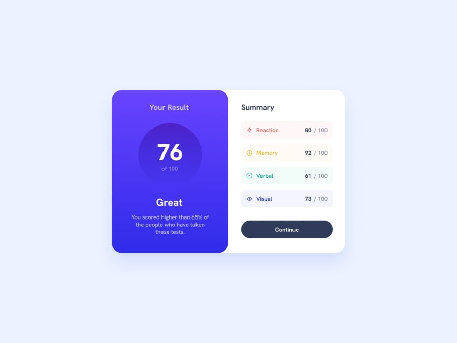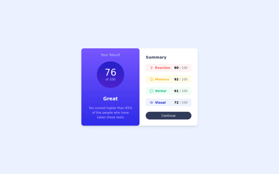
Design comparison
Solution retrospective
Thank you for taking the time to check out my frontend design using Tailwind CSS.
I would love to hear your thoughts on the design, and any feedback or alternative solutions you might have for the result summary. Your input will help me improve my skills as a developer and create even better designs in the future. So please feel free to leave a comment or suggestion, and I'll be sure to take them into consideration.
Thank you again for your time and feedback!
Community feedback
- @piyushpaliwalPosted over 1 year ago
Great work there! I was just going through your code and here are a few observations I have.
- Used color hex codes directly inline (ex - Line 47).
- This will make your code less maintenable, instead you can define a
tailwind.config
object on your script tag and add all colors there so that you can reference them back in your code. See here for details
- This will make your code less maintenable, instead you can define a
- While utilizing Tailwind, it is one of the best practices to have classes sorted out as recommended by the devs, see here. As of now it is difficult to find a class in your project because of the order.
Marked as helpful0@rickyreza12Posted over 1 year agoThank you @piyushpaliwal for your feedback! I appreciate your observations and suggestions.
Regarding the use of color hex codes directly inline, I agree that it can make the code less maintainable. Defining a tailwind.config object on the script tag and adding all colors there would indeed make the code more organized and easier to maintain.
In addition, sorting classes as recommended by the Tailwind devs is a great practice to follow. I will make sure to sort the classes in my project accordingly, so that it is easier to find a specific class.
Again, thank you for taking the time to provide feedback on my code. I will take your suggestions into consideration to improve the maintainability and organization of my code.
0 - Used color hex codes directly inline (ex - Line 47).
- @sumanth-chandanaPosted over 1 year ago
Hi mate!, congrats🎉 on completing the challenge. Better take care about following points.
- You don't have to use
srcset
in theimg
tag while already usingsrc
property. - Always check Frontendmentor Report Generator issues after submitting the project for removing errors and warnings.
- Use the
alt
(alternate text) attribute as mentioned in your Accessibility Report.alt
attribute is used for Screen readers applications. - Why does alt attribute matter? Read here.
- To avoid accessibility issues "All page content should be contained by landmarks" use code as :
<body> <main> ---your code here---- </main> <footer> </footer> </body>
(why does
<main>
matter? Read here )- For proper centering the container(whole card) vertically and horizontally you can also use the following simple block of code use code:
body{ display: flex; align-items: center; justify-content: center; height: 100%; } or
body { min-height: 100vh; display: grid; place-content: center; }
- When we open the GitHub repository link, you will find an About Section on the right side. There, also include a live preview link of your project. It is better for someone to check your live project while interacting with code. **I hope you will find this Feedback Helpful.**
Marked as helpful0@rickyreza12Posted over 1 year agoThank you @sumanth-chandana for your feedback
I appreciate your suggestions for improving my project. I will definitely take note of the following points:
I will remove the unnecessary srcset attribute from the img tag as I am already using the src attribute.
I will make sure to check the Frontendmentor Report Generator issues after submitting the project for removing errors and warnings.
I will add the alt attribute to the images in my project as mentioned in the Accessibility Report. I understand that it is important for screen reader applications and will make sure to use it.
I will contain all page content by landmarks and use the <main> element for the main content of the page. I understand the importance of this for accessibility and will implement it accordingly.
I will use the suggested code to center the container (whole card) vertically and horizontally.
I will include a live preview link of my project in the About section on my GitHub repository.
Thank you once again for taking the time to provide feedback on my project. Your suggestions will definitely help me improve the quality and accessibility of my code.
1 - You don't have to use
Please log in to post a comment
Log in with GitHubJoin our Discord community
Join thousands of Frontend Mentor community members taking the challenges, sharing resources, helping each other, and chatting about all things front-end!
Join our Discord