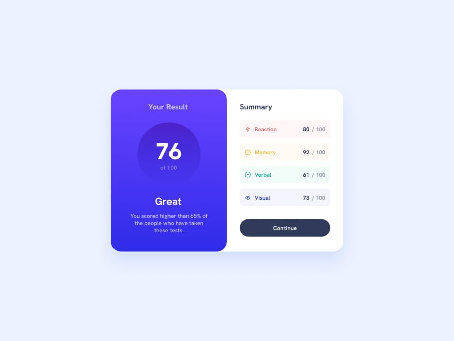
Design comparison
Solution retrospective
Hello, newbie here. I have some couple of questions.
-
Is there any standard way of organizing your CSS and HTML code?
-
Can I get some feedback about my code style because I know when it comes to bigger projects it would become very messy?
-
Also, I had trouble using flex box with making my 2 divs equally the same width at a constant container width that is why I use grid. I tried flex: 1; but does not seem to work. What do you think is the problem there.
Community feedback
- @CryoDeltaPosted about 2 years ago
Newbie to newbie communication:
-
"Is there any standard way of organizing your CSS and HTML code?" I think both of these languages kinda force you to code like they intend you to since otherwise your code will look messy. You should make your Html code to look like an assemblement of boxes and use the cascading nature of Css to avoid repetition. Html forces you by making it hard to position things like you'd want to otherwise and Css by making you rewrite everything for each element.
-
"Can I get some feedback about my code style because I know when it comes to bigger projects it would become very messy?" I think... it's fine?
-
"Also, I had trouble using flex box with making my 2 divs equally the same width at a constant container width that is why I use grid. I tried flex: 1; but does not seem to work. What do you think is the problem there." Have you looked at the "flex-basis" CSS property? https://developer.mozilla.org/en-US/docs/Web/CSS/flex-basis
Marked as helpful2@CarlosSimon02Posted about 2 years ago@CryoDelta Hey, this is really helpful. I really appreciate your comment. Thanks for the link, I'll check it out.
0 -
- @sumanth-chandanaPosted about 2 years ago
Hi mate!, congrats🎉 on completing the challenge. Better take care about following points.
- Always check Frontendmentor Report Generator issues after submitting the project for removing errors and warnings.
- Use the
alt(alternate text) attribute as mentioned in your Accessibility Report.altattribute is used for Screen readers applications. - Why does alt attribute matter? Read here.
- To avoid accessibility issues "All page content should be contained by landmarks" use code as :
 <body>
    <main>
        ---your code here----
    </main>
  <footer>
  </footer>
</body>
(why does
<main>matter? Read here )- For proper centering the container(whole card) vertically and horizontally you can also use the following simple block of code use code:
body{
    display: flex;
    align-items: center;
    justify-content: center;
    height: 100%;
}
or
body { min-height: 100vh; display: grid; place-content: center; }- When we open the GitHub repository link, you will find an About Section on the right side. There, also include a live preview link of your project. It is better for someone to check your live project while interacting with code.
I hope you will find this Feedback Helpful.
Marked as helpful1@CarlosSimon02Posted about 2 years agoHello @sumanth-chandana. I did not use alternate text because I thought the label would be enough even without the icon, but I guess it's not? Thanks for this very informative and detailed feedback.
1
Please log in to post a comment
Log in with GitHubJoin our Discord community
Join thousands of Frontend Mentor community members taking the challenges, sharing resources, helping each other, and chatting about all things front-end!
Join our Discord
