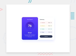
Design comparison
Solution retrospective
All feedback will be highly appreciated
Community feedback
- @SutonTochPosted over 1 year ago
Good Job!
There are a few things I learned from your contribution:
- @import in .css
- variables for font-size and font-weight
- transition on the continue button
Thank you very much for that :)
Things you could improve in your design:
- You're not using gradients. Take a look at the MDN linear-gradient() documentation (https://developer.mozilla.org/en-US/docs/Web/CSS/gradient/linear-gradient)
- Your media-query: since the desktop design is for 1440px, I would only display it if the viewport is 1440px (-> min-width: 1440px).
- The score-container was also something I struggled with. A few tips for improvement:
- If you want to center with margin, use margin: 0 auto, which basically means margin-top and margin-bottom are 0 and left and right is auto. But in this case you can also use display: inline-block so that text-align centers the element, because text-align not only centers text but all inline-elements.
- I wouldn't use padding to create the circle shape. If "of 100" breaks into a new line, it breaks the circle. I feel like, this is one of those rare occasions where absolute height & width is justified (e.g. height: 150px, width: 150px). Might be wrong here, tho.
- After removing your negative margins, this should create the circle-shape that you want :)
- Instead of the light-grayish background on .container, you could use a box-shadow that is shifted to the right to create contrast between the white summary-container and the white website background (mdn: https://developer.mozilla.org/en-US/docs/Web/CSS/box-shadow)
- You seem to struggle with color of the maximum score in the summary-component. I struggled there too. Try using your neutral-dark-gray-blue + opacity: ...
A few more general tips:
- Try organizing your CSS from the least-specific to the most-specific, since in CSS, whatever is below something overwrites what's above. E.g. .text-center should be above .result-container or .wrapper should be above .reaction-container and co.
- I'd recommend using rem for font-size instead of em. rem is more absolute since it looks at the root font size (usually 16px) whereas em uses the font-size of the current element or parent (depending on if you apply it to font-size or padding).
- Avoid negative margins, since it's usually a sign that you're fighting against already written CSS. Therefore, the solution is usually elsewhere. Sadly, I don't have enough experience to say where negative margins are good, maybe somebody else can chime in on that.
- media-queries should have absolute values (such as px) instead of em. Simply to have a better understanding where the breakpoints are, because em is more illusive.
- min/max-height/width should probably be absolute values (such as px) too. Same reason as media-queries.
That was a lot.. I bet it takes time to think through everything I've listed here, and that's totally okay. Anyway, I hope this helps :). If you still have any questions, feel free to throw them my way.
I really liked that you used the mobile-first approach, used plenty of variables and had a very clean HTML with good class- and variable-names.
Thx again for your contribution! Looking through your code helps me to get better as well!
Marked as helpful1@cacti00Posted over 1 year agoThank you for this well detailed feedback gonna help me a lot @SutonToch
1
Please log in to post a comment
Log in with GitHubJoin our Discord community
Join thousands of Frontend Mentor community members taking the challenges, sharing resources, helping each other, and chatting about all things front-end!
Join our Discord
