Submitted about 2 years agoA solution to the Results summary component challenge
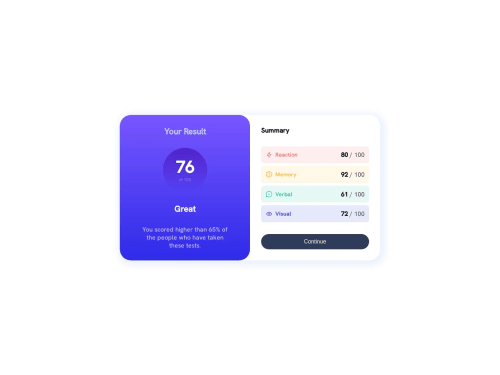
Result summary component using HTML and CSS Flex
@stan545

Solution retrospective
I've just completed a front-end coding challenge from @frontendmentor! 🎉
You can see my solution here: https://www.frontendmentor.io/solutions/result-summary-component-using-html-and-css-flex-aL-_lEcDzc
Any suggestions on how I can improve are welcome!
Code
Loading...
Please log in to post a comment
Log in with GitHubCommunity feedback
No feedback yet. Be the first to give feedback on Henry's solution.
Join our Discord community
Join thousands of Frontend Mentor community members taking the challenges, sharing resources, helping each other, and chatting about all things front-end!
Join our Discord