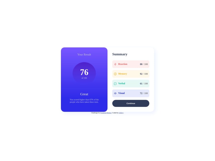
Result summary component using gird and media query
Design comparison
Solution retrospective
The difficult part is the media query. It looks like that I have to redefine the sizes, width and height all over again. My css looks like a mess, not quite readable. I am still figuring out a way to reduce the use of class.
Community feedback
- @0xabdulkhaliqPosted almost 2 years ago
Hello there 👋. Congratulations on successfully completing the challenge! 🎉
- I have other recommendations regarding your code that I believe will be of great interest to you.
POINTING CURSOR ↗️:
- Looks like the component's
buttonelement has not a pointer, this property plays a major-role in terms of both UI & UX
- The
cursor: pointerCSS property is important for button-like elements because it changes the cursor from the default arrow to a pointer when hovering over the element. This provides a visual cue to the user that the element is clickable and encourages interaction.
- In terms of UI/UX, using
cursor: pointerhelps to improve the usability of the interface by making it easier for users to identify interactive elements. It also helps to provide feedback to the user by indicating which elements are clickable and which are not.
- So we want to add this property to the following
buttonelement
button { cursor: pointer; }- Now your component's
buttonhas got the pointer & you learned about this property as well
.
I hope you find this helpful 😄 Above all, the solution you submitted is great !
Happy coding!
Marked as helpful0 - @NehalSahu8055Posted almost 2 years ago
Hello Coder 👋.
Congratulations on successfully completing the challenge! 🎉
Few suggestions regarding design.
-
Use gradient
button:hover -
background-image: linear-gradient(#6542FE,#342CE2); -
Use
max-widthinstead ofwidthto make your design responsive -
Use
cursor:pointerfor buttons for more user friendly. -
Use
Semanticsfor the proper design of your code.
<body>
<header>
<nav>...</nav>
</header>
<main>...</main>
<footer>...</footer>
</body>
I hope you find this helpful.
Happy coding😄
Marked as helpful0 -
- @john-miragePosted almost 2 years ago
Hello, did you wrote the css from mobile to desktop ?, if not it's maybe a better idea to go mobile first, it should be easier and more readable (and it's a best practice because of the mobile devices performances)
0@jeffreylaichunghangPosted almost 2 years agoIndeed. I kind of feeling the same way when I finish it. Can you tell me more about why it is beneficial to mobile devices performances please?@john-mirage
0@john-miragePosted almost 2 years ago@jeffreylaichunghang When writing desktop first, a mobile device has to load the desktop styles by default and after the mobile styles in the media queries so all the styles is loaded. When mobile first you load the mobile styles by default but not the desktop styles (because of the media queries). So a mobile device has to load less styles when writting mobile first.
Marked as helpful0
Please log in to post a comment
Log in with GitHubJoin our Discord community
Join thousands of Frontend Mentor community members taking the challenges, sharing resources, helping each other, and chatting about all things front-end!
Join our Discord
