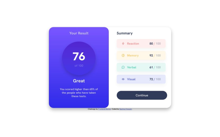
Result Summary Component using CSS Flexbox, Javascript


Design comparison

Solution retrospective
Hello Frontend Mentor Community,
Any feedback is welcome.
Thank you.
Community feedback
- @Kamlesh0007Posted over 1 year ago
Congratulations on completing the challenge!🎉. That's a great achievement, and I'm sure you put a lot of effort into it. I really liked the way you approached the challenge and the code you wrote. You demonstrated a good understanding of the concepts and applied them effectively to solve the problem.I have a few suggestions to improve your code further. You need to make the responsive design for mobile devices here is the code that u need to add for responsiveness
@media screen and (max-width: 750px) { .result__container { background: linear-gradient(hsl(252, 100%, 67%), hsl(241, 81%, 54%)); padding: 2.4rem 2.8rem; text-align: center; border-radius: 0 0 30px 30px; // add this } .grid { grid-template-columns: 1fr; } }0@nazimulhossainPosted over 1 year ago@Kamlesh0007 Thank you for the suggestion.
I did use media queries for mobile view at breakpoint 26em.
0@Kamlesh0007Posted over 1 year ago@nazimulhossain max-width 750 px will be better
0

Please log in to post a comment
Log in with GitHub
Join our Discord community
Join thousands of Frontend Mentor community members taking the challenges, sharing resources, helping each other, and chatting about all things front-end!
Join our Discord