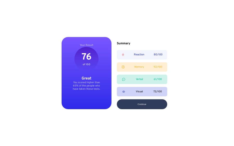
Design comparison
Solution retrospective
This project took me long then normal, much due to my office work but also because of getting to understand semantics, and I hope I did work out better.
- Did I made semantic more clear than my previous commits?
- What other feedback you can give me if I revisit this challenge?
Community feedback
- @0xabdulkhaliqPosted over 1 year ago
Hello there 👋. Congratulations on successfully completing the challenge! 🎉
- I have other recommendations regarding your code that I believe will be of great interest to you.
HTML 🏷️:
- This solution may cause accessibility errors due to lack of semantic markup, which causes lacking of landmark for a webpage and allows accessibility issues to screen readers, due to accessibility errors our website may not reach its intended audience, face legal consequences, and have poor search engine rankings, highlighting the importance of ensuring accessibility and avoiding errors.
- What is meant by landmark ?, They used to define major sections of your page instead of relying on generic elements like
<div>or<span>. They are use to provide a more precise detail of the structure of our webpage to the browser or screen readers
- For example:
- The
<main>element should include all content directly related to the page's main idea, so there should only be one per page - The
<footer>typically contains information about the author of the section, copyright data or links to related documents.
- The
- So resolve the issue by replacing the
<div class="container">element with the proper semantic element<main>in yourindex.htmlfile to improve accessibility and organization of your page
.
I hope you find this helpful 😄 Above all, the solution you submitted is great !
Happy coding!
Marked as helpful1 - @mynorzsPosted over 1 year ago
Hi, I'm still learning code, but I can give you some feedback regarding the visual accuracy of your implementation. I'm a UX/UI designer and I'm used to give visual reviews of implemented products, so I hope I give you some useful advice that can polish your deliverables.
- When you switch to the desktop version, the card is not showing the drop shadow that the design specifies, so the white halve of the card gets lost with the background.
- On the violet part of the card, check for the accurate distribution that the design presents. The design specifies an equal or even distribution vertically, but yours is stacked to the top, without respecting gaps and margins.
- In the summary section, each list item's background is to opaque, you could try making it more transparent. Also, the elements inside each item are evenly distributed, while the design presents and spaced between distribution, between two groups: icon+title ----- progress numbers.
- Inside the summary items, the progress shows two different styles in the original design, the completed amount has to show with a heavier font weight.
Those are some points you could review to polish your game for visual reviews.
I hope this was of some help.
1
Please log in to post a comment
Log in with GitHubJoin our Discord community
Join thousands of Frontend Mentor community members taking the challenges, sharing resources, helping each other, and chatting about all things front-end!
Join our Discord
