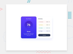
Design comparison
Solution retrospective
The responsive design aspect was a bit difficult, and i'm not sure of how good this looks on a tablet device.
Community feedback
- @SuperJulia2024Posted about 1 year ago
Hi Salami,
If I may, I think you have forgotten to apply the right family font (Hanken Grotesk (https://fonts.google.com/specimen/Hanken+Grotesk), for this challenge). To do this, you have to go to google fonts, look for this font family and select the version for weights 500, 700 and 800. Then copy-past the link tag in the head of your html file, and set font-family: 'Hanken Grotesk', sans-serif; to your html element Then, it will look like more like the proposed design ;-)
I hope it helps !
0
Please log in to post a comment
Log in with GitHubJoin our Discord community
Join thousands of Frontend Mentor community members taking the challenges, sharing resources, helping each other, and chatting about all things front-end!
Join our Discord
