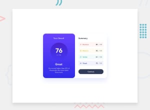
Design comparison
Community feedback
- @Saad-HishamPosted over 1 year ago
Great job on the solution! The design looks amazing✨, and it's clear that you put a lot of effort into it. I have a few suggestions that I think could make it even better:
First, for accessibility, it's a good idea to wrap the entire card inside a main tag instead of a div. This provides a semantic structure for your content and can improve accessibility for assistive technologies.
Secondly, I think it would be great to add some styling to the button to match the design. You can add a cursor pointer and a gradient background color to make it stand out more. Here's an example of how you can do this:
button.button {
  cursor: pointer;
  background: rgb(103, 67, 255);
  background: linear-gradient(
    180deg,
    rgba(103, 67, 255, 1) 34%,
    rgba(49, 44, 235, 1) 100%
  );
}
Overall, the solution looks awesome! I hope you find these tips helpful. Keep up the great work! 💥
Marked as helpful0 - @lack21Posted over 1 year ago
Good job 👍, but I have some recommendations!
- Remove
margin: 1.25remfrom thebody, it adds unnecessary space! - Instead of
width: 45%in.container, setwidth: min(40rem, 90%)on it, like this it will adjust on medium size devices!
Marked as helpful0 - Remove
Please log in to post a comment
Log in with GitHubJoin our Discord community
Join thousands of Frontend Mentor community members taking the challenges, sharing resources, helping each other, and chatting about all things front-end!
Join our Discord
