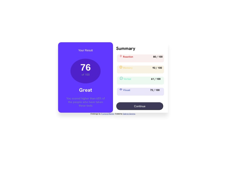
Design comparison
SolutionDesign
Solution retrospective
I still have issues on making my website responsive. I would appreciate if someone can give me a detailed response on how to achieve that. Thanks.
Community feedback
- @LemidinkuPosted about 1 year ago
You should consider using CSS flex-box. and change the flex-direction from row to column as the view changes to mobile-mode. You can do this in your already created media query.
0
Please log in to post a comment
Log in with GitHubJoin our Discord community
Join thousands of Frontend Mentor community members taking the challenges, sharing resources, helping each other, and chatting about all things front-end!
Join our Discord
