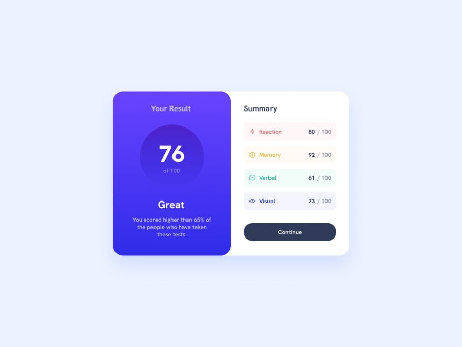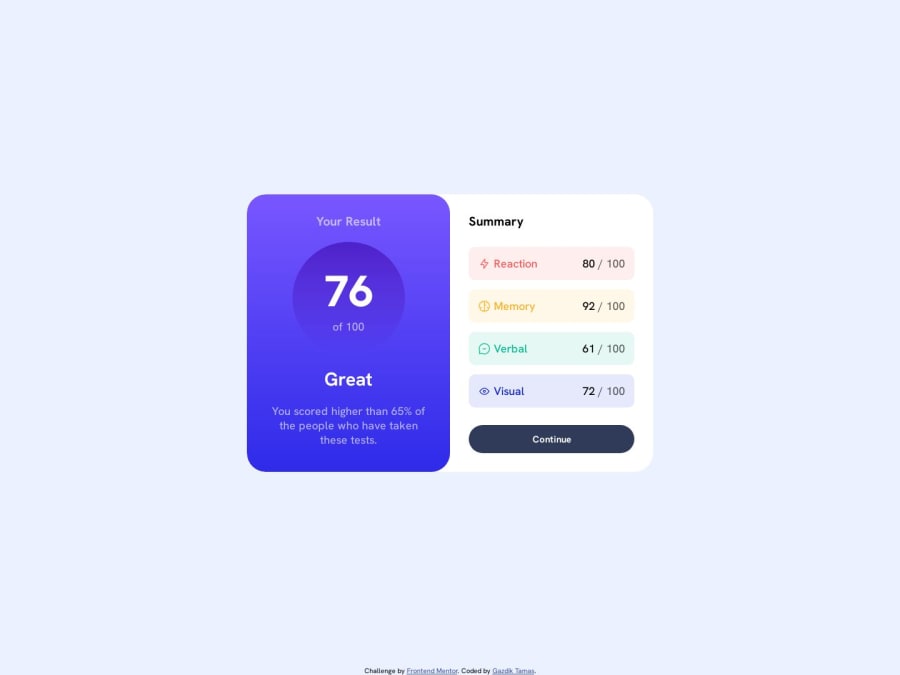
Result Summary Component - semantic HTML5 & CSS3
Design comparison
Solution retrospective
Hi all,
Couple of questions from my side regarding the solution:
#1 Semantic HTML and accessibility:
- Do you think I overdid the accessibility with all the
aria-label
andaria-labelledby
properties on pretty much all of my elements? It kind of felt redundant providing IDs only to be used by other elements for thearia-labelledby
attribute. - I used
article
elements for the two main parts of the content, because I thought they'd make sense on their own. Later I usedsection
elements for different the attribute sections. Would you have done it differently?
#2 CSS
- For mobile layout I I used Flexbox for the body display style and changed it to Grid for desktop layout. Even though it looks the way I want it, it feels like a lot of extra work. Do you think the same could be achieved with less code?
- Can you tell me an easier way to create a layout where we have the main content in exactly the middle of the page and some footer at the bottom? I used below solution, but once again it's seems too complicated for a relatively easy problem:
body { display: grid; grid-template-rows: auto min-content auto min-content; justify-content: center; }
then for main content:
main { grid-row: 2 / 3; }
and for the footer:
footer { grid-row: 4 / -1; }
As always, any feedback on the code or best practices is appreciated, but I'd be really glad if someone could answer the questions above. Thanks for the opportunity, happy coding!
Community feedback
- @akpekigPosted over 1 year ago
#1 Semantic HTML and accessibility:
- The use of
aria-label
andaria-labelledby
is more incorrect than redundant. You can use the accessibility tree view in Chrome Developer tools to see how. The content flow doesn't match the content itself. As a result, the overall score is read as "Overall Score" (enter group) > "76" > (leave group) > (navigate to next element) > "of 100" > (enter group) > "of 100". To amend this consider changing the wrapping element.score__container
to a paragraph and the inner paragraphs to spans. Then you can put usearia-label
exclusively on the new paragraph or use a heading immediately before it. Here's my example. For increased reading fluidity, I hid the styled spans and used a visually hidden span for screen readers.
<h2 class="sr-only">Overall score</h2> <p class="score__container" tabindex="0"> <span class="sr-only">76 out of 100</span> <span class="score__overall fw-800" aria-hidden="true">76</span> <span class="fs-18 opaque fw-500" aria-hidden="true">of 100</span> </p>
NB:
aria-labelledby
should be used only when standard labelling elements (e.g.,label
,h1
,h2
) cannot be used or in order to reduce redundancy when other labels require the same label in standard labelling elements. See more here- The use of sections is really good in the "Summary" article. Great job on that! I don't think I would have done it differently. However, I would make each section a little more semantic and accessible for screen readers like this:
<section class="property__details memory__section" tabindex="0" aria-describedby="memory-score"> <div class="property__container"> <img src="assets/images/icon-memory.svg" alt=""> <h3 id="memory" class="property__name memory">Memory</h3> </div> <p id="memory-score" class="sr-only">92 out of 100</p> <p class="property__score" tabindex="0" aria-hidden="true"><b>92</b></p> </section>
#2
- I think the switch between flexbox and grid is relatively efficient, but you could also consider not having any set display on the body and instead changing the main element's position width and height at different breakpoints.
- Also relatively efficient but if you follow the above solution, you can alternatively try changing adding
position: relative
to the body element and thenposition: absolute
to its children, setting thetop
,bottom
, etc. accordingly. However, this just about amounts to the same number of lines.
Marked as helpful1@tamasgazdikPosted over 1 year agoHey @akpekig ! π
I want to thank you so much for providing such an extensive feedback on my solution and questions. It really means a lot to me!
I've incorporated most of what you recommended here into my solution, however I still have got a couple questions if you don't mind.
- When it comes to ensuring the accessibility for your projects, do you use any other tools other than the built-in DevTools? Maybe some screen readers that you would recommend?
- For the
sr-only
class do you have some kind of best practice that you'd use for each of your projects? I skimmed through some of your GitHub repos, though I couldn't find use of such class in that short time. I found one online that seems to be working just the way I want it, though it looks quite cumbersome despite how simple a task it needs to achieve:
.screen__reader__only { clip: rect(1px, 1px, 1px, 1px); clip-path: inset(50%); height: 1px; width: 1px; margin: -1px; overflow: hidden; padding: 0; position: absolute; }
- at your memory section part recommendation the last
<p>
hastabindex="0"
, despite setting it hidden for accessibility devices witharia-hidden="true"
. Being able to tab to something that should be hidden seems a bit contradicting to me. Wouldn't it cause any issues with accessibility devices? Also when I inspect this<p>
element with the Accessibility Tree in DevTools, I can see it's content added to the Section'sName
attribute, resulting in Memory 92 out of 100 92 / 100.
I haven't experimented with your recommendations on the layout yet, but will definitely give it a try.
I just wanted to let you know that I really appreciate your help so far, and that I didn't forget about you at all, just had to make the time to respond. π
0@akpekigPosted over 1 year ago@tamasgazdik Np! I'm glad I could help.
- No, there aren't really a lot of tools out there, so I'd recommend learning the ins and outs on your own. Unfortunately, as it stands, accessibility is very programmatic, with the most popular tools focusing mainly on colour contrast and screen readers and even accessibility leaders like W3 unable to cover all the bases. There are some tools that "mimic" a screen reader by stripping your whole page down to just text content (I use ARIA DevTools for this), but even screen readers aren't universal. Tools like pa11y also do something a little like Lighthouse, but again, very visual/hearing impairment focused. Personally, I just turn my device's screen reader on and off. It helps to have a shortcut for this purpose. Additionally, there are way more user needs than visual/hearing impairments. A talented web developer compiled them into this book. Kitty Giraudel is another developer working to expand accessibility and she often posts pretty useful snippets.
- On most of the projects I work on (private because they're proprietary, sorry π), stylesheets are often pre-processed or taken from templates that do have this class or something similar. Bootstrap and Tailwind both have this class built-in, but yes, the snippet you posted is good too. Compared to other snippets, it isn't too lengthy IMO.
- My bad, I think that was an error. I meant to put the tab index on the section element, especially because this helps with keyboard navigation too. That said, even though it isn't semantically appropriate, you can tab into an aria-hidden element and I think most screen readers will simply understand it as tabbing into its nearest non-hidden element.
1@tamasgazdikPosted over 1 year ago@akpekig
I haven't used Bootstrap or Tailwind yet, but I hear they're game changers so I'm looking forward to get to know them.
Regarding the tab order now I'm just curious how a screen reader would interpret it by tabbing into it, despite being
aria-hidden
, so I might just make a little experiment soon...Thanks once again for your inputs and the sources on a11y, I'll definitely check them out!
Happy coding! π
0 - The use of
- @0xabdulkhaliqPosted over 1 year ago
Hello there π. Congratulations on successfully completing the challenge! π
- I have other recommendations regarding your code that I believe will be of great interest to you.
DECORATIVE SVG'S β¨οΈ:
- The
alt
attribute is used to provide alternative text for images in HTML documents. Thealt
attribute is used by screen readers to describe the image to visually impaired users, which is essential for web accessibility.
- Now, when it comes to decorative
SVGs
, they are used purely for aesthetic purposes and do not convey any important information or functionality to the user.
- Since these images do not convey any important information or functionality, there is no need for an
alt
attribute.
- So feel free to set the
alt
attribute as""
for decorativesvg's
, becausealt=""
will be skipped by screen readers they will consider the image as decoration
Example:
<img src="images/decorative.svg" alt="">
<img src="assets/images/icon-reaction.svg" alt="Reaction icon"> π <img src="assets/images/icon-reaction.svg" alt="">
.
I hope you find this helpful π Above all, the solution you submitted is great !
Happy coding!
Marked as helpful1@tamasgazdikPosted over 1 year agoHi @0xAbdulKhalid !
Thanks for the suggestion, makes total sense. I'll incorporate this suggestion in the code π
0 - @LoaiEsam37Posted over 1 year ago
You're really talented at coding! Your work is impressive. Your solution is so elegant and efficient. Keep going !!!
1@tamasgazdikPosted over 1 year ago@LoaiEsam37
Thank you for your kind words, Loai, I appreciate that! :)
1
Please log in to post a comment
Log in with GitHubJoin our Discord community
Join thousands of Frontend Mentor community members taking the challenges, sharing resources, helping each other, and chatting about all things front-end!
Join our Discord