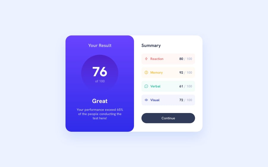
Result Summary Component - React, Typescript, Vite, SCSS
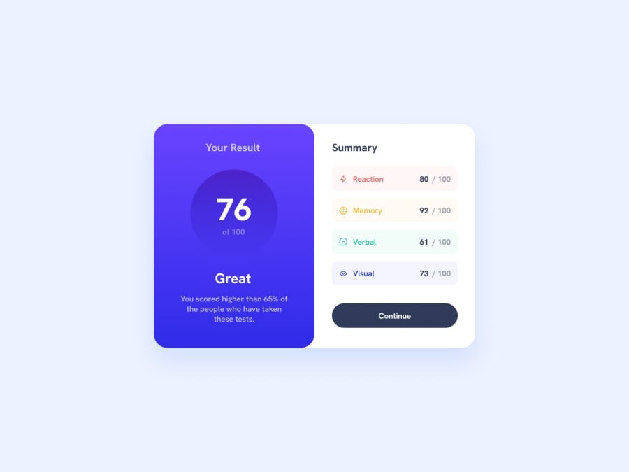
Design comparison
Solution retrospective
Hello fellow coders, On this project, just like the other ones, I have tried something different. Even though it is a small project, I decided to take on the challenge using the best practices when it comes to SCSS. I didn't use all the features available such as layout and functions, but I have used mixins and adding breakpoints using the mixins. I will continue to work on my SCSS skills on the following projects, so if you guys have any questions or suggestions please feel free to ask or share. Feedback is always welcome.
Community feedback
- P@jairovgPosted almost 2 years ago
Hi @newbpydev, congrats on your solution; here are some comments that might help you to improve it:
- First of all, nice use of a modularized structure of your styles, using SCSS variables, BEM and mixins.
- A couple of suggestions around this. (1) using colour variables linked to colour names, like red or yellow may take you to unnecessary refactors if the colour change; instead, try to use variables scoped to features or categories, (2) I invite you to use also CSS variables
- You're setting a fixed
font-sizeof10pxto the page, so even as you're usingremfor your font sizes, you're injecting an accessibility issue, as even if the user changes the browser font size, they will be always calculated with a base of10px. - It might be a discussion if it's better to use
remor fixed units likepxto offset values, likemarginorpadding; personally I think that usingremof these offsets is not the best option as if a user increases the browser font size, you're reducing the content space and it may get the component to rare visual states. - The button doesn't have a focus state which induces an accessibility issue. A user that uses the keyboard to navigate the page will never know when is on the button element unless it's using assistive technology.
- Take a look at devices with medium sizes, like iPad Air or Mini, with
820pxand768pxeach. Even there is no design for those devices, if you take a look, the component seems to be floating. - This is your page
heading map:
1 Your Result
2 76
2 Great
2 Summary
3 Reaction
3 Memory
3 Verbal
3 Visual
Think about a table of contents of the page and see if it's a good distribution. I'm not saying yours is good or bad, just think about it.
- There are some recurring categories in the summary section, is it a
divthe best semantic element for this?
I hope you find it useful. I'm happy to take another look at your solution if you make some other changes.
Marked as helpful1@newbpydevPosted almost 2 years agoHey there @jairovg, Thanks for the feedback, You made some good points, I always think about the naming convention, and if I should rename them, when I was thinking about the variables section I try to be as clear as possible so I don't have to wonder too much which one I need to use. In fact that is why I made it like so, if I need to change that color then I can easily find and replace all at once from the VSCode finder, it was really intentional, the same goes for the font-size in the html tag, it is just to make my life easier when converting my rem, but it is also meant for those that change their fontsize on the browsers, they can do so and the size of the html should be in the correct ratio. I got this technique from one of my instructors and it has been a godsend.
I get a programmer-block when it comes to doing these components challenges and trying to figure out which heading should I use for each section. I can see it better when I build a full site, but in components I go completely blank, if you have any suggestion how you would tackle the heading issue I would gladdly appreciate it.
1 Your Result 2 Summary
I think this might be better and let the rest be <p>, if it were a full site I would have put both of them on the same heading level, but since we need one h1 to get the code without any complaints from the FEM system.
0P@jairovgPosted almost 2 years agoHey @newbpydev
...if I need to change that color then I can easily find and replace all at once from the VSCode finder
I totally understand your point, but let me put it differently. Imagine a huge project when you have lots of files referencing a variable named
$text-dark-navy(based on names of this project), vs using a variable named$color-text-primaryor also, that not all the places where the colour$text-dark-navyneeds to change, but only some of them; then a full find and replace won't be the best solution....the same goes for the font-size in the html tag, it is just to make my life easier when converting my rem, but it is also meant for those that change their font size on the browsers
Yes, the conversion thinking on a base font size of
10pxis easier, but the problem you have is setting thehtmlwith a fixed size of10px, a user that changes its browser font size to another one, won't tell the difference, as the base is fixed to10px. Here is a trick that might help you, set yourhtmlfont size to62.5%or0.625em, with this setup, you have the10pxyou're looking for, as the browsers default font size is16px....if you have any suggestion how you would tackle the heading issue I would gladdly appreciate it.
Here is how I handled it:
Results summary component | Frontend Mentor

1 Your Result 76 of 100
2 Summary
But for me, there is an
article>headerelement enclosing all the blue section (including Great, Your performance...)Marked as helpful0@newbpydevPosted almost 2 years agoHey there, @jairovg, thanks again for your feedback, you made a good point with the fixed size, I forgot about about the use of percentage, I used to use it on my code, and somehow just sat on the fixed value, but I used ems in percentage instead, but on my media I still keep it in ems and adjust accordingly, thanks for reminding me. Ah also thanks for the explanation of the color choice, it makes sense to think about it this way too. I am getting prepared for my next challenge and I am taking notes on your feedback, thanks for taking the time to clear some doubts.
0 - @0xabdulkhaliqPosted almost 2 years ago
Hello there 👋. Congratulations on successfully completing the challenge! 🎉
- I have other recommendations regarding your code that I believe will be of great interest to you.
DECORATIVE SVG'S ♨️:
- The
altattribute is used to provide alternative text for images in HTML documents. Thealtattribute is used by screen readers to describe the image to visually impaired users, which is essential for web accessibility.
- Now, when it comes to decorative
SVGs, they are used purely for aesthetic purposes and do not convey any important information or functionality to the user.
- Since these images do not convey any important information or functionality, there is no need for an
altattribute.
- So feel free to set the
altattribute as""for decorativesvg's, becausealt=""will be skipped by screen readers they will consider the image as decoration
Example:
<img src="images/decorative.svg" alt=""><img src="./assets/images/icon-reaction.svg" alt="Reaction" class="summary-stat__icon"> 👇 <img src="./assets/images/icon-reaction.svg" alt="" class="summary-stat__icon">
.
I hope you find this helpful 😄 Above all, the solution you submitted is great !
Happy coding!
Marked as helpful0@newbpydevPosted almost 2 years agoHi @0xAbdulKhalid, thanks for the feedback, I thought about this issue when I got to the icons, for this project I was more focused on the SCSS side of things, but I do have to keep these things in mind, I guess that even though I wanted to focus more on SCSS, I should still use the best practices, thanks.
0
Please log in to post a comment
Log in with GitHubJoin our Discord community
Join thousands of Frontend Mentor community members taking the challenges, sharing resources, helping each other, and chatting about all things front-end!
Join our Discord
