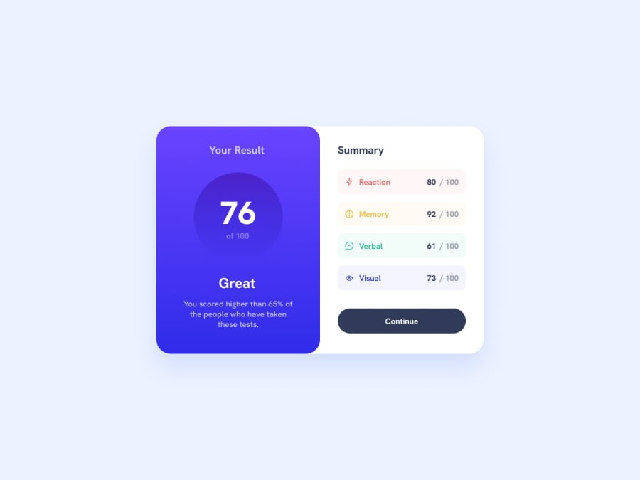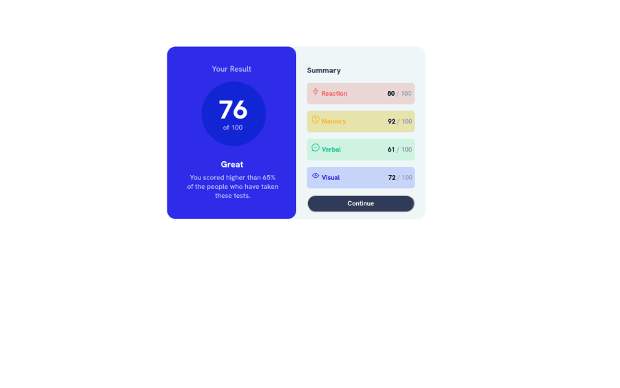
Result Summary Component page using HTML and CSS.
Design comparison
Solution retrospective
I have completed the project as per mentioned, but I have not completed the mobile design. Can anyone help me with the media queries?
Community feedback
- @DesireyePosted over 1 year ago
Hi! The way I made my page responsive was by making the
flex-direction: column;
assuming you useddisplay: flex;
Also it would be advisable for you to put all your work in a
<main>
tag, which helps the editor know the main content of your page.Hope I helped :D
0 - @0xabdulkhaliqPosted over 1 year ago
Hello there π. Congratulations on successfully completing the challenge! π
- I have other recommendations regarding your code that I believe will be of great interest to you.
HTML π·οΈ:
- This solution generates accessibility error reports, "All page content should be contained by landmarks" is due to
non-semantic
markup, which lack landmark for a webpage
- So fix it by replacing the
<div class="container-1">
element with the semantic element<main>
in yourindex.html
file to improve accessibility and organization of your page.
- What is meant by landmark ?, They used to define major sections of your page instead of relying on generic elements like
<div>
or<span>
- They convey the structure of your page. For example, the
<main>
element should include all content directly related to the page's main idea, so there should only be one per page
HEADINGS β οΈ:
- And, this solution has also generated accessibility error report due to lack of level-one heading
<h1>
- Every site must want at least one
h1
element identifying and describing the main content of the page.
- An
h1
heading provides an important navigation point for users of assistive technologies, allowing them to easily find the main content of the page.
- So we want to add a level-one heading to improve accessibility by reading aloud the heading by screen readers, you can achieve this by adding a
sr-only
class to hide it from visual users (it will be useful for visually impaired users)
MEDIA QUERIES :
- As a fellow front-end developer, i suggest go with mobile first workflow.
- It gives so much ability design the layout effectively.
- If you want to know more about mobile first workflow then check this video
.
I hope you find this helpful π Above all, the solution you submitted is great !
Happy coding!
0
Please log in to post a comment
Log in with GitHubJoin our Discord community
Join thousands of Frontend Mentor community members taking the challenges, sharing resources, helping each other, and chatting about all things front-end!
Join our Discord