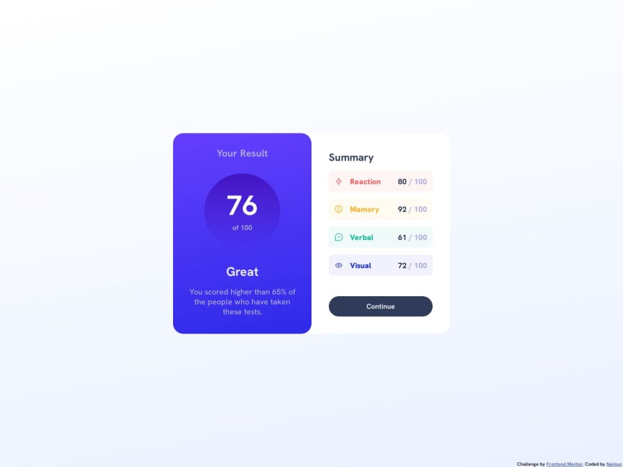
Design comparison
Solution retrospective
Hello, I’m Naimur and this is my solution.
Can you review my solution and any suggestions for me how I can improve?
Thank you.
Community feedback
- @maliabadziukhPosted about 1 year ago
Hi Naimur, your solution looks great!
A few pointers:
- You did not include an assets folder in your project directory, so the icons throw an error since the file cannot be found.
- You can use display: flex for the <section> (justify and align center) in order to center your component on the page. Now it's a bit off-center to the bottom.
- Since you are using flexbox for the card layout, you can also use flex: 50% for both left and right cards instead of specifying their width in rem.
I am relatively new to front-end, so test out / research my suggestions before implementing them, but I think they would be nice improvements :)
1@NaimurRahman00Posted about 1 year agoHello @maliabadziukh ,
I'm sorry, I didn't notice that I didn't add the assets folder. I will add it soon.
I was trying many times to keep the card in the middle, but I couldn't. I will definitely try it again.
Also I have seen your code, I think I can learn something from here.
Thanks for your feedback!
1
Please log in to post a comment
Log in with GitHubJoin our Discord community
Join thousands of Frontend Mentor community members taking the challenges, sharing resources, helping each other, and chatting about all things front-end!
Join our Discord
