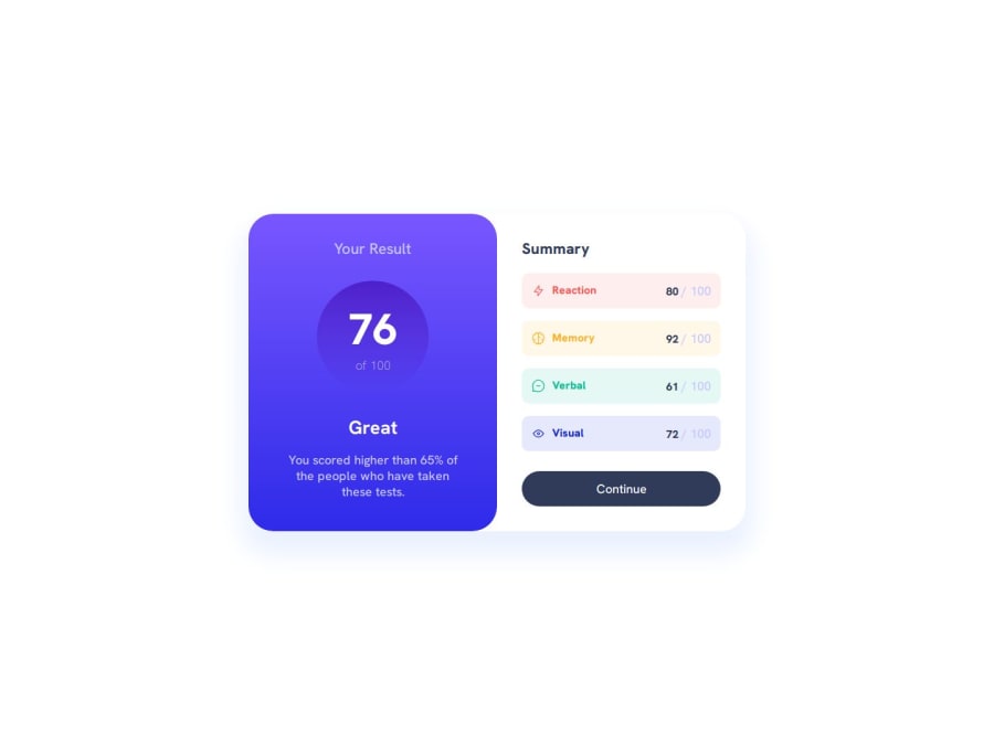
Design comparison
SolutionDesign
Community feedback
- @bienvenudevPosted 7 months ago
Hello!
Well done, here are some things to improve:
- Try to make this responsive on all screen sizes.
- Include a modern CSS reset at the beginning of your styles to help normalize browser defaults and provide a clean foundation for your project. (Check out this article: https://www.joshwcomeau.com/css/custom-css-reset/)
- This design has no header. Headers are for repeating content across a site not for page-specific content.
- Your media query should be in rem or em not px.
- Avoid setting font sizes in px, use rem instead.(https://www.joshwcomeau.com/css/surprising-truth-about-pixels-and-accessibility/#accessibility-considerations-5).
- For decorative images, alt should be blank.
Additional resources:
- Kevin Powell's walkthrough: https://www.youtube.com/watch?v=KqFAs5d3Yl8
- A free course on building responsive layouts (https://courses.kevinpowell.co/conquering-responsive-layouts)
I hope these tips and resources are helpful! Feel free to connect and ask any questions you might have.
Happy Coding!
Marked as helpful1@apii2Posted 7 months agoThank you for your suggestion and time. I would surely watch and follow your guide @jwben1
1
Please log in to post a comment
Log in with GitHubJoin our Discord community
Join thousands of Frontend Mentor community members taking the challenges, sharing resources, helping each other, and chatting about all things front-end!
Join our Discord
