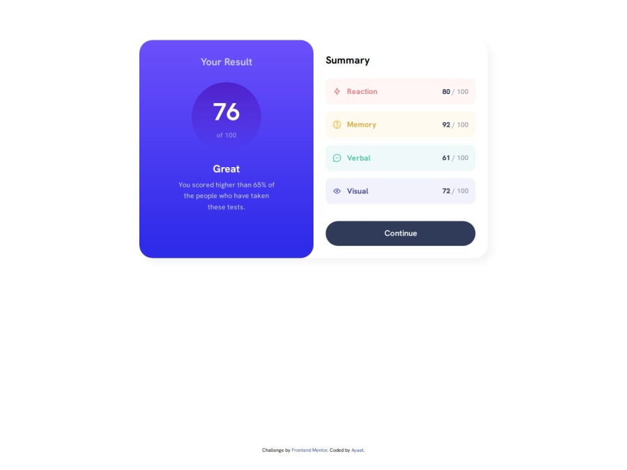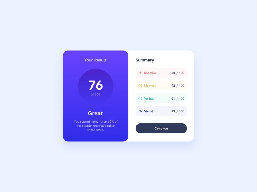
Design comparison
Solution retrospective
I am becoming more fond of searching for solutions online rather that relying on memory.
It also helped to inspect the webpage to know exactly how things line up; sometimes, the solution can be discovered by analysing the page through the browser dev tools.
What challenges did you encounter, and how did you overcome them?There were a few challenges I encountered;
- The syntax for linear-gradient as I very rarely use the property, which is crazy as it looks so cool, a quick search on the MDN web docs page and I found the syntax.
- Trying to keep content on the left and right side of the card on the desktop design equal in size. I searched for solutions on flexbox and got things like flex-basis and flex as properties to make them equal, however, the issue lied in my CSS, the left and right boxes had different padding on the their left and right sides, and I found this out by inspecting the elements using dev tools.
- I rarely use box-shadows as well so forgot how the content looked. The MDN web resource was also helpful and because I loved how the shadow looked on the reference design, I copied and saved the code for quick implementation in the future.
I would like help with feedback on the structure of some of the elements I used in the project including; the 'paragraph' and 'span' elements which I used to create the different categories that were on the right or bottom side of the card.
Community feedback
Please log in to post a comment
Log in with GitHubJoin our Discord community
Join thousands of Frontend Mentor community members taking the challenges, sharing resources, helping each other, and chatting about all things front-end!
Join our Discord
