Design comparison
SolutionDesign
Solution retrospective
Your feedback and suggestions are greatly appreciated!
Community feedback
- @aykinsancakliPosted 10 months ago
Feedback for @Charles-Mc-Vigo
Hi Charles,
Your solution looks great! 👏
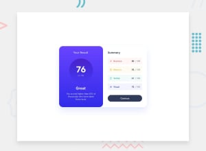
I noticed a small tweak that could enhance the realism of the card. Instead of applying the box shadow only to the right container, consider wrapping both the left and right containers into a single div and then applying the box shadow to the entire card. This can give it a more cohesive and realistic appearance.
Here's a quick example:
<div class="card-container">
    <!-- Left Container -->
    <div class="left-container">
        <!-- Content for the left container -->
    </div>

    <!-- Right Container -->
    <div class="right-container">
        <!-- Content for the right container -->
    </div>
</div>
And in your CSS
.card-container {
    box-shadow: 0 4px 8px rgba(0, 0, 0, 0.1); /* Adjust the values as needed */
}

.left-container {
    /* Styles for the left container */
}

.right-container {
    /* Styles for the right container */
}
I hope this suggestion adds a bit more realism to the card design. Best of luck, and great job overall!
Cheers, Aykın
Marked as helpful0
Please log in to post a comment
Log in with GitHubJoin our Discord community
Join thousands of Frontend Mentor community members taking the challenges, sharing resources, helping each other, and chatting about all things front-end!
Join our Discord
