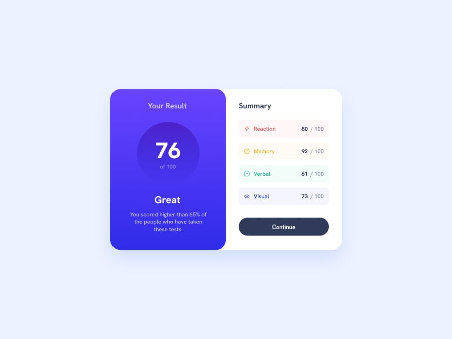
Design comparison
Solution retrospective
I am proud of being able to come up with the "aspect-ratio" to make a circle. And also understood the linear-gradient very well.
What challenges did you encounter, and how did you overcome them?I had the problems of creating a cirlce and background-gradient.
What specific areas of your project would you like help with?IN the aspect of background-gradient.
Community feedback
- P@MikDra1Posted 6 months ago
If you want to make your card responsive with ease you can use this technique:
.card {
width: 90%;
max-width: 37.5rem;
}
On the smaller screens card will be 90% of the parent (here body), but as soon as the card will be 37.5rem (600px) it will lock with this size.
Also to put the card in the center I advise you to use this code snippet:
.container {
display: grid;
place-items: center;
}
Hope you found this comment helpful 💗💗💗
Good job and keep going 😁😊😉
Marked as helpful0 - @justCaioDevPosted 6 months ago
Nice job! 👍
When you use linear-gradient you can set a direction of this gradient. example: background-image: linear-gradient(to top, var(--secondary-gradient-bg), var(--primary-gradient-bg));
You can use deg too ex.: 45deg or 180deg
Marked as helpful0
Please log in to post a comment
Log in with GitHubJoin our Discord community
Join thousands of Frontend Mentor community members taking the challenges, sharing resources, helping each other, and chatting about all things front-end!
Join our Discord
