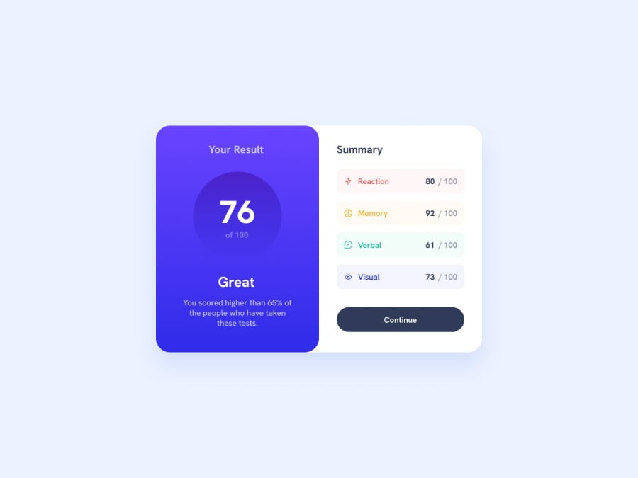
Design comparison
SolutionDesign
Community feedback
- P@developer-rubenPosted 11 months ago
Hi!
Here are my tips for your component:
- Please separate HTML from CSS by putting the CSS in a separate file
- Use rem or em instead of pixels, especially for font-sizes, since this overrides the user setting in the browser settings
- Missing the correct font family (it's available in the assets folder)
- avoid max with on the body, or center it when it's larger than 1400 pixels..
- the component is missing the box-shadow, please add it so it stands out a bit better!
Best, Ruben
0
Please log in to post a comment
Log in with GitHubJoin our Discord community
Join thousands of Frontend Mentor community members taking the challenges, sharing resources, helping each other, and chatting about all things front-end!
Join our Discord
