

Design comparison

Solution retrospective
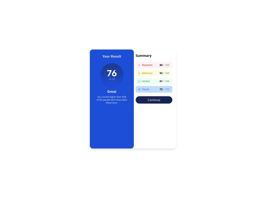
I just learnt TailwindCSS and I completed this task with TailwindCSS.
What challenges did you encounter, and how did you overcome them?I had issues with the mobile viewport height and i wasn't sure 100dvh is the perfect parameter to use for that. I am open to corrections.
What specific areas of your project would you like help with?#Mobile viewport height #General Corrections and things i could have done better
Community feedback
- @cristianccggPosted 12 months ago
Hi. Looks nice, as a suggestion you can set the right card to display flex, flex direction = column, and then use "justify content = space evenly". That way your elements will be separated, filling the whole height of the card vertically with the same space between them.
Marked as helpful1@BlarQPosted 12 months ago@cristianccgg Noted, Thank you very much for the corrections.
0

Please log in to post a comment
Log in with GitHubJoin our Discord community
Join thousands of Frontend Mentor community members taking the challenges, sharing resources, helping each other, and chatting about all things front-end!
Join our Discord