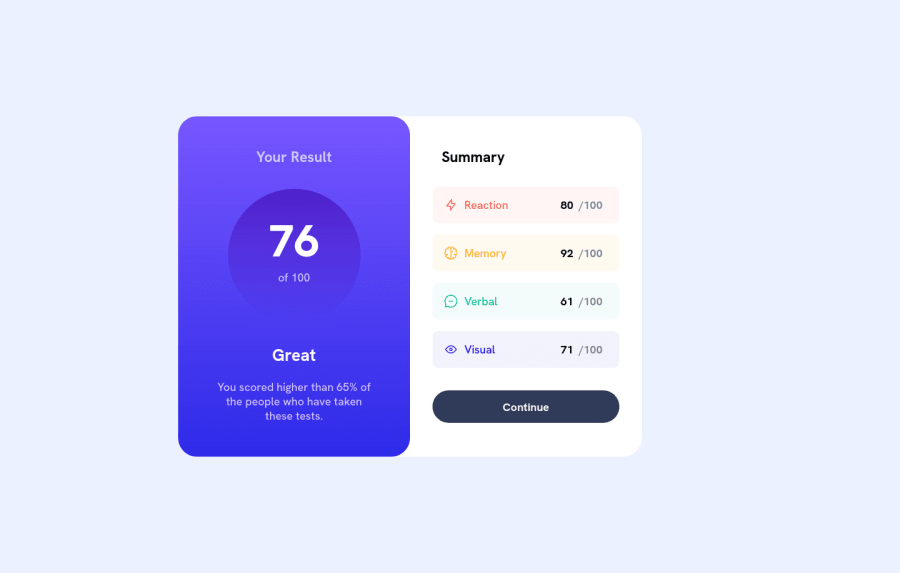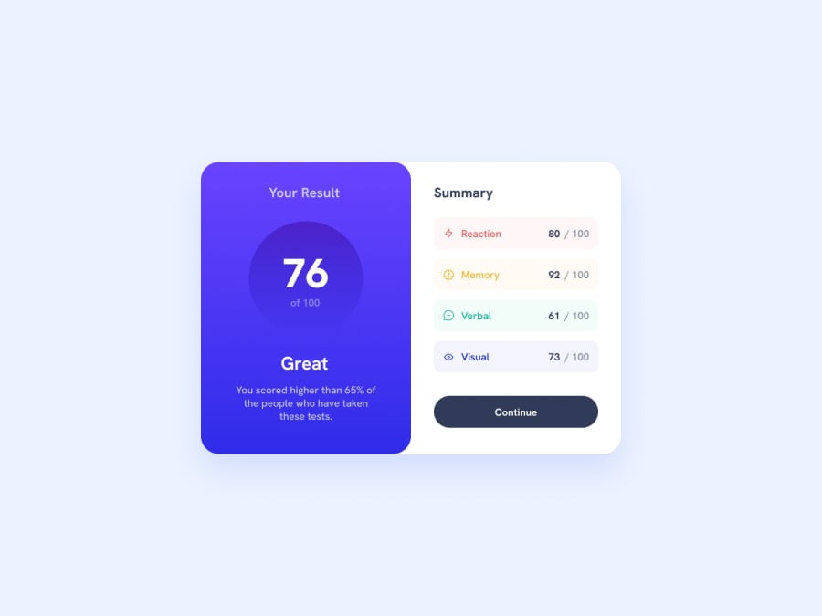
Design comparison
Solution retrospective
Hello,
Please tell me if it is one of the good way to do this, and how can I improve this ?
Thanks !
JJ
Community feedback
- P@visualdennissPosted about 2 years ago
Hey there,
Great work!
Your card seems to bit off center due to width: 90% you have given to the body. If you remove that, problem gets solved. There is no need to make body 90% width.
Also you can update your * with this: * { font-family: var(--font-family); font-size: var(--font-size); margin: 0; padding: 0; }
to get some minimal CSS resetting for default margins/paddings that are added. (There seemed to be some default margin applied to the body)
Hope you find this feedback helpful!
Marked as helpful0 - @0xabdulPosted about 2 years ago
Hello there first congratulations on completing the results summary card component 🤩
- A little bit of suggestions for improve your code
- the html page Must have one main land mark..
- why use the main landmark ?
- The main landmark should be a top-level landmark. When a page contains nested document and/or application roles (e.g. typically through the use of iframe and frame elements), each document or application role may have one main landmark
- for recommendations full article [click here]- for suggestions full article main landmark
- Landmarks
The following landmarks are defined on this page: - Banner - Complementary - Contentinfo - Main - Navigation- My suggestion use its easy way
- Ex
<body> <div class="container" role="main"> //Whole html code here 🏷️ </div> </body>- Happy Coding 😃
Marked as helpful0
Please log in to post a comment
Log in with GitHubJoin our Discord community
Join thousands of Frontend Mentor community members taking the challenges, sharing resources, helping each other, and chatting about all things front-end!
Join our Discord
