Not Found
Not Found
Not Found
Not Found
Not Found
Not Found
Not Found
Not Found
Not Found
Not Found
Not Found
Not Found
Not Found
Not Found
Not Found
Not Found
Not Found
Not Found
Not Found
Not Found

Submitted

Result Summary component

@Ernestsomto

Desktop design screenshot for the Results summary component coding challenge

This is a solution for...

  • HTML
  • CSS
1newbie
View challenge

Design comparison


SolutionDesign

Solution retrospective


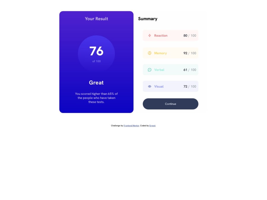
The hardest part of the project was getting the gradient color just right, i didn't though... i will keep practicing though . This is my own solution to the result summary component. i used html mark up and Css flex

Community feedback

Unkookerinhoβ€’ 460

@Unkookerinho

Posted

Hi Ernest! πŸ‘‹ Congratulations on completing this challange! You did a great job! πŸ˜ƒ I found some things that can you improve in your code.

  • Instead of using px for almost everything in your code, learn about using another units like ems or rems that are responsive unlike pixels. Here is really helpful video about when to use particular unit - https://www.youtube.com/watch?v=N5wpD9Ov_To
  • To center main content of your page you can use flexbox on the body like this:
display: flex;
flex-direction: column;
align-items: center;
justify-content: center;
min-height: 100vh;

First 4 lines are setting up flexbox and centering all its contents in a column, so attribution will be under main content. Setting min height is to make sure that body will cover entirety of the page.

  • Instead of width:800px you can use max-width:800px, so responsiveness of the page is much better - when screen is smaller width of main element will shrink, but on bigger screen it will take all the space you want it to.
  • margin: 60px auto on .Wrapper is messing up your layout, especially on mobile where it just leaves 60px gap on top of the screen, so it's better removing this line.
  • You can add target="blank" in your attribution, it will open a new tab in the browser which is a lot better than opening it in the same tab.
  • In your HTML file instead of using bunch of divs, you should use semantic html5 markup, like <main>, <footer> or <section>. This is important to make your code more readable and easier to understand. You can read more about it there - https://developer.mozilla.org/en-US/docs/Glossary/Semantics

I hope you find my answer helpful, and I wish you happy coding! πŸ˜ƒ Keep up your great work!

Marked as helpful

0

@Ernestsomto

Posted

Wow thanks so much bro, i will improve the codes with this corrections for sure @Unkookerinho

0
Unkookerinhoβ€’ 460

@Unkookerinho

Posted

@Ernestsomto I'm glad I could help! πŸ˜„

Marked as helpful

0

Please log in to post a comment

Log in with GitHub
Discord logo

Join our Discord community

Join thousands of Frontend Mentor community members taking the challenges, sharing resources, helping each other, and chatting about all things front-end!

Join our Discord