

Design comparison

Community feedback
- @Journey-of-EnergyPosted over 1 year ago
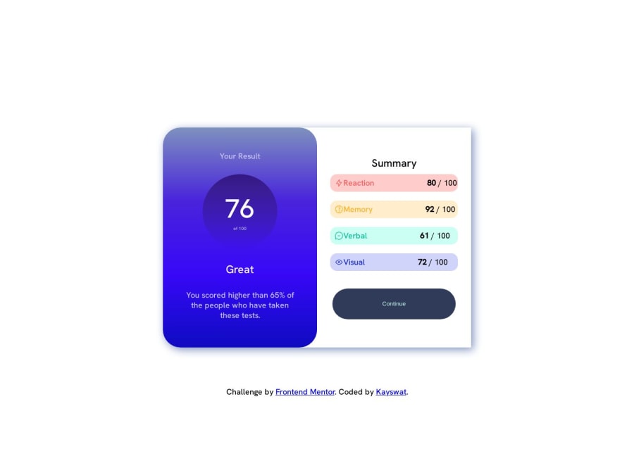
Hello, congrats for your solution! Few things to improve: Font weights are little bit inaccurate. Try to check on that, and adjust it a little. Whole solution is not bad at all, little thing i would simply change after font weights is "summary" heading. I checked your CSS and HTML files, and you include summary heading into whole flexbox. The way i would approach this is that i would leave heading separately, i would put those 4 rows into flex box, and button i would also have separately and place it into center by itself, or put it into separate flexbox and justify it there to have more control over it. Try to play with it a little more, and it could be better, but good start there!
0@kayswatPosted over 1 year ago@Journey-of-Energy Thank you very much for your candid review and comment on my work, I will look into the suggested opinions and put more work. Thank you once again
0

Please log in to post a comment
Log in with GitHubJoin our Discord community
Join thousands of Frontend Mentor community members taking the challenges, sharing resources, helping each other, and chatting about all things front-end!
Join our Discord