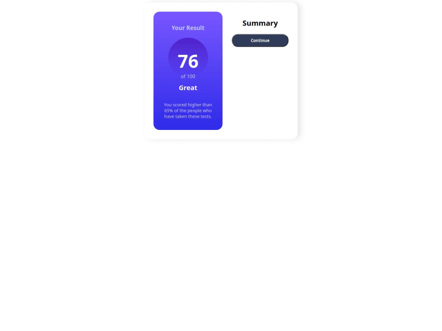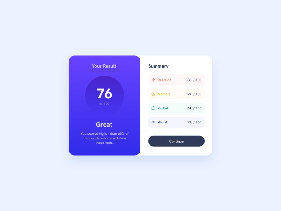
Design comparison
Solution retrospective
-
I'm most proud of the overall design and layout of the CSS code. The use of variables for colors and font weights makes the code more maintainable and scalable.
-
One thing I would do differently next time is to add more comments to the code to explain the purpose of each section and the reasoning behind certain design decisions. This would make the code more readable and easier to understand for others.
Responsive design: The code lacked a clear responsive design strategy, which made it challenging to adapt the layout to different screen sizes and devices. I had to add media queries and adjust the layout to ensure a smooth user experience across various devices. But i don't think that i succeed doing that.
What specific areas of your project would you like help with?I would like to get help on following topics:
- Consistency in naming conventions for classes and variables
- Adding more comments to explain the purpose of each section and design decisions
- Improving accessibility features, such as color contrast and ARIA attributes
- Refining the responsive design for mobile devices
- Optimizing the code for better performance and maintainability
Community feedback
Please log in to post a comment
Log in with GitHubJoin our Discord community
Join thousands of Frontend Mentor community members taking the challenges, sharing resources, helping each other, and chatting about all things front-end!
Join our Discord
