Not Found
Not Found
Not Found
Not Found
Not Found
Not Found
Not Found
Not Found
Not Found
Not Found
Not Found
Not Found
Not Found
Not Found
Not Found
Not Found
Not Found
Not Found
Not Found
Not Found

Submitted

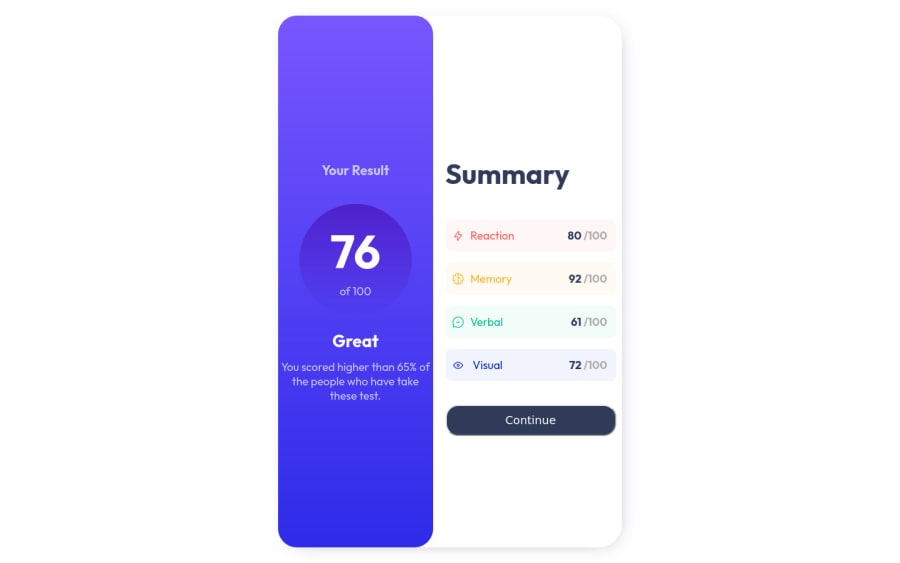
Result Summary Card (Self-taught, constructive criticism welcomed!)

KinginGuzmanβ€’ 30

@KinginGuzman

Desktop design screenshot for the Results summary component coding challenge

This is a solution for...

  • HTML
  • CSS
1newbie
View challenge

Design comparison


SolutionDesign

Solution retrospective


Any tips or advice ? New to coding and I'm going the self-taught route so any advice helps.

Community feedback

Abdul Khaliq πŸš€β€’ 72,660

@0xabdulkhaliq

Posted

Hello there πŸ‘‹. Congratulations on successfully completing the challenge! πŸŽ‰

  • I have other recommendations regarding your code that I believe will be of great interest to you.

CSS 🎨:

  • Looks like the component is oversized in its height values, But i can help you to have a better component by updating your css style rules from the following css
.main-content {
  width: 50em;
  height: 30em;
  justify-content: center;
}
  • These css rules can help to have a better structured component.

HEIGHT πŸ“:

  • Use min-height: 100vh for main instead of height: 100vh. Setting the height: 100vh may result in the component being cut off on smaller screens.
  • For example; if we set height: 100vh then the main will have 100vh height no matter what. Even if the content spans more than 100vh.
  • But if we set min-height: 100vh then the main will start at 100vh, if the content pushes the main beyond 100vh it will continue growing. However if you have content that takes less than 100vh it will still take 100vh in space.

.

I hope you find this helpful πŸ˜„ Above all, the solution you submitted is great !

Happy coding!

1

KinginGuzmanβ€’ 30

@KinginGuzman

Posted

Thank you very much ! I was so stuck and was getting annoyed on how it kept cutting out πŸ˜…. Appreciate the comment it was very helpful, thank you ! @0xAbdulKhalid

0
Abdul Khaliq πŸš€β€’ 72,660

@0xabdulkhaliq

Posted

@KinginGuzman Glad you found it helpful ! 🀠

0
kirtyβ€’ 380

@kirtymeena

Posted

Hi,

The UI looks good. Great job πŸ‘.

But it is not responsive. For a small screen, the size doesn't readjust. I would suggest you learn about media queries.

Also, the card seems to touch the edges of the screen from the top and bottom so you can add some padding for the top and bottom.

1

KinginGuzmanβ€’ 30

@KinginGuzman

Posted

Thank you ! I had trouble with the readjusting, but I been looking into some solutions. Again thank you! @kirtymeena

1

Please log in to post a comment

Log in with GitHub
Discord logo

Join our Discord community

Join thousands of Frontend Mentor community members taking the challenges, sharing resources, helping each other, and chatting about all things front-end!

Join our Discord