Design comparison
Solution retrospective
Hi everyone, it was worth giving a try and it helped me practice my flex box tutorials well. pls critize
Community feedback
- @Bibiwei-PerePosted about 1 year ago
Hi
Congratulations on completing this challenge
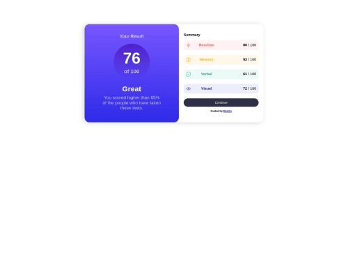
You did great but I noticed that the desktop version of your challenge is not properly centered. To fix this create a CSS for your body tag in your style.css and add the following.
body { display: flex; flex-direction: column; align-items: center; justify-content: center; min-height: 100vh; }
Overall, you did a great job 👍
Hope you find this helpful
Marked as helpful1@Benjamin-odekinaPosted about 1 year agogood day! your review was super helpful. Thanks, allot.
please what is the meaning of 'all page content should contain a landmark?' been trying to correct that since @Bibiwei-Pere0@Bibiwei-PerePosted about 1 year ago@Benjamin-odekina Hi, the reason you're having that error is because you didn't use landmark tags. You used alot of div. Some examples of these landmark tags are :
<nav></nav>
Commonly added after the open body tag and contains your navbar. But it's not needed for this challenge.
<main></main>
Comes just after the nav tag. All other tags like div, h1, span, section and so on will be located inside it. You are having that landmark error because you didn't use this tag
<section></section>
Comes within the main tag and it's used to separate the different parts in your code. You code for example has 2 sections, the body container div and the head container div. Therefore, you need to add the following section tag.
<main class="contentarea"> <section class="head-container"> *Then add the rest tags here* </section> <section class="body-container"> *Then add the rest tags here* </section> </main>
<footer></footer>
Comes after the closing main tag and contain the footer details.
Check this Solution for more info.
Hope you find this helpful
0 - @d3vaqaPosted about 1 year ago
well done. just the height looks so different compared to the original design. if you could adjust the height. it will be looking much nicer. thanks
Marked as helpful1
Please log in to post a comment
Log in with GitHubJoin our Discord community
Join thousands of Frontend Mentor community members taking the challenges, sharing resources, helping each other, and chatting about all things front-end!
Join our Discord