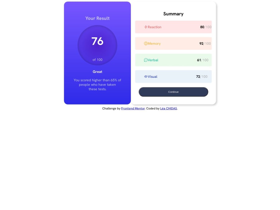
Design comparison
SolutionDesign
Community feedback
- @eremitaitoPosted about 1 year ago
to center the container, you can use flex
body {
    min-height: 100vh;
    display: flex;
    align-items: center;
    justify-content: center;
}
Marked as helpful0@eremitaitoPosted about 1 year ago@eremitaito, also, delete the div
</body>
</html>
  <div class="attribution">
    Challenge by <a href="https://www.frontendmentor.io?ref=challenge" target="_blank">Frontend Mentor</a>.
    Coded by <a href="#">Léa CHIDAS</a>.
  </div>
</body> this
</html> and this
and then put the div above
  <div class="attribution">
    Challenge by <a href="https://www.frontendmentor.io?ref=challenge" target="_blank">Frontend Mentor</a>.
    Coded by <a href="#">Léa CHIDAS</a>.
  </div>
</body>
</html>
Marked as helpful0@Lea225Posted about 1 year ago@eremitaito Thanks for pointing this out to me, it was a mistake.
1
Please log in to post a comment
Log in with GitHubJoin our Discord community
Join thousands of Frontend Mentor community members taking the challenges, sharing resources, helping each other, and chatting about all things front-end!
Join our Discord
