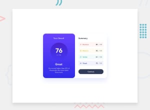
Design comparison
SolutionDesign
Community feedback
- @jairovgPosted over 1 year ago
Hi @Saguneo, congrats on your solution; here are some comments that might help you to improve it:
- Even if the challenge is a single component and you probably won't have a page in a real project with just one of it, think about how to improve the component's semantics. May it have a main title? Probably a subtitle in any particular section? Just to give you an example: You have some recurrent categories for the summary section, is the
<div>element the best one to use for each category? MDN docs have a guide named Content Categories that may help you with this. - You have multiple
a11yissues; you can use tools like axe dev tools if you're not using them yet. - If you run an
a11yaudit you will notice 9 serious issues, 7 of then related to colour contrast that are easily fixed on this challenge, but on a daily basis may be handled with the UX designer, and another one that is"Ensures interactive controls are not nested as they are not always announced by screen readers or can cause focus problems for assistive technologies", related to theanchoryou have within thebuttonyou can read more about this issue on the Deque University Axe rules page.
I hope you find it useful. I'm happy to take another look at your solution if you make some other changes.
0 - Even if the challenge is a single component and you probably won't have a page in a real project with just one of it, think about how to improve the component's semantics. May it have a main title? Probably a subtitle in any particular section? Just to give you an example: You have some recurrent categories for the summary section, is the
Please log in to post a comment
Log in with GitHubJoin our Discord community
Join thousands of Frontend Mentor community members taking the challenges, sharing resources, helping each other, and chatting about all things front-end!
Join our Discord
