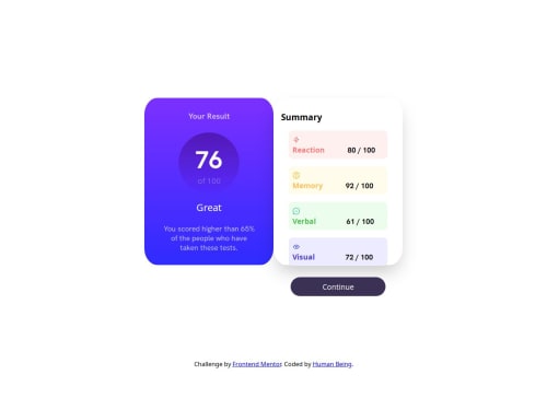
Result Component using HTML & CSS

Solution retrospective
Im most proud of completing the challenge I really liked the way the original design looked so I pushed myself to see if I could recreate it as close as possible. Don't have any comments on what I would do differently next time at the moment. Im just glad I was able to do a similar job! :)
What challenges did you encounter, and how did you overcome them?The biggest challenge I encountered was probably getting the two card elements to stack upon each other during a screen resize from desktop to mobile.
What specific areas of your project would you like help with?I would like feedback on correctly using the span element. I had a bit off trouble using multiple classes to achieve the design I wanted but it ended up working out.
Please log in to post a comment
Log in with GitHubCommunity feedback
No feedback yet. Be the first to give feedback on univxrse's solution.
Join our Discord community
Join thousands of Frontend Mentor community members taking the challenges, sharing resources, helping each other, and chatting about all things front-end!
Join our Discord