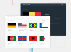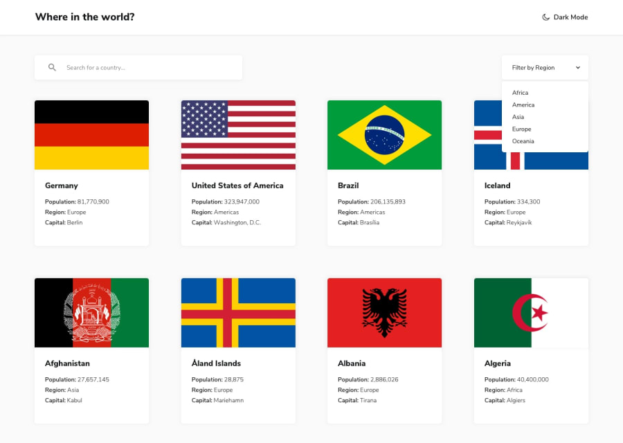
Design comparison
SolutionDesign
Community feedback
- @JustShuaibPosted over 2 years ago
Hi there. I must say I love your solution, It's really good work. I would like to point out some things though:
- Firstly, maybe you did not take note but your font is different from the one in the disign. Also, I noticed that the search and the filter are not synced. Like when I'm in Africa and I search for China I still brings it. China is not part of Africa.
Within each country's detail, clicking on the border country is supposed to take me to the page about the country. It doesn't.
Also, after filtering based on region, there is no way for me to go back to the full list of the countries.
0
Please log in to post a comment
Log in with GitHubJoin our Discord community
Join thousands of Frontend Mentor community members taking the challenges, sharing resources, helping each other, and chatting about all things front-end!
Join our Discord
