

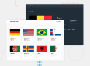
Design comparison
Solution retrospective
Fun Challenge ✔✔✔ I'm down for any improvement
Community feedback
- @Augustine-edehPosted 12 months ago
Great work! Well done, Yup.
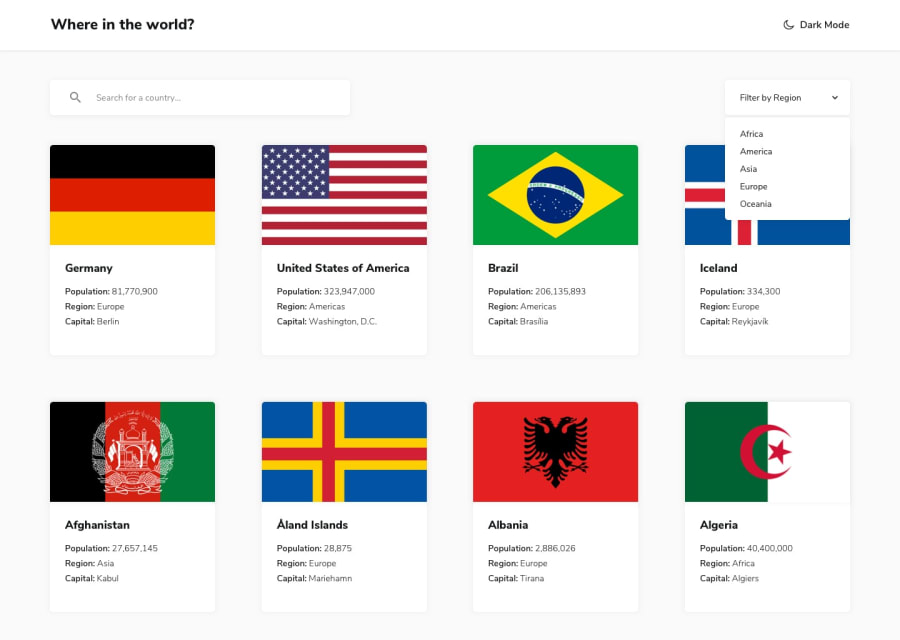
I however think that the flag on the country detail page could be better optimized as it becomes unpredictable when the page size is adjusted to a certain small device size.
Cheers!
1@gws-jenny-andrewsPosted 12 months ago@Yup03 The issue is that the design specification for this challenge is poor. You can either do as @Augustine-source has done and set a fixed height and width on each card/image which due to the flags having different aspect ratios, means this will stretch the images or you use object-fit and make a design choice about the origin to show the flag at its best.
Also, the given design is manipulated as those countries don't come in order and it fails to deal with countries with long names going on to multiple lines and how that should be dealt with
I think, you've done a great job, but like everything, if the design is no good, the result will never fit expectations !!
You might want to consider either truncating with ellipsis the country name or setting a fixed height and clamping to a set number of lines.
I'm, also not sure why you wouldn't choose grid layout for this. For me, this is the perfect candidate for that !
HTH
Marked as helpful1@Yup03Posted 12 months agoThanks @gws-jenny-andrews for your suggestion
I actually used grid for the layout , but maybe some cards are streched because of some countries name which are expanded into two lines or more
I didn't take that into consideration as i used the common and not the official property
But i'll will surely apply some workaround and try to fix it
1


Please log in to post a comment
Log in with GitHubJoin our Discord community
Join thousands of Frontend Mentor community members taking the challenges, sharing resources, helping each other, and chatting about all things front-end!
Join our Discord