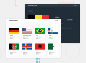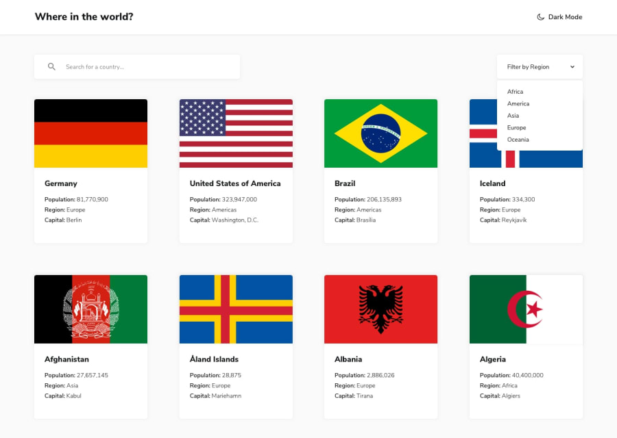
Design comparison
Solution retrospective
This was a pain in a half to complete but I did it either way the most annoying part was some countries weren't made equal some have no neighbors countries some no capital etc. so on some countries the styling is bit off. If you have any way to improve my JS or CSS or how to some good practices for coding or structure my app pls tell me
Community feedback
- @Ayman-Shakil192Posted about 2 years ago
Hello, Tien! You did an amazing job finishing the assignment!
Here are some ideas I believe you may use to enhance the user interface. . Add some space between your material to give the contents a chance to breathe xD. . It would be a nice idea to include buttons that navigate to that specific country's border. country . Check out my solution if you need inspiration. . Overall, an excellent effort! Bravo for all your effort!
Marked as helpful0
Please log in to post a comment
Log in with GitHubJoin our Discord community
Join thousands of Frontend Mentor community members taking the challenges, sharing resources, helping each other, and chatting about all things front-end!
Join our Discord
