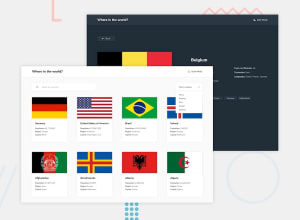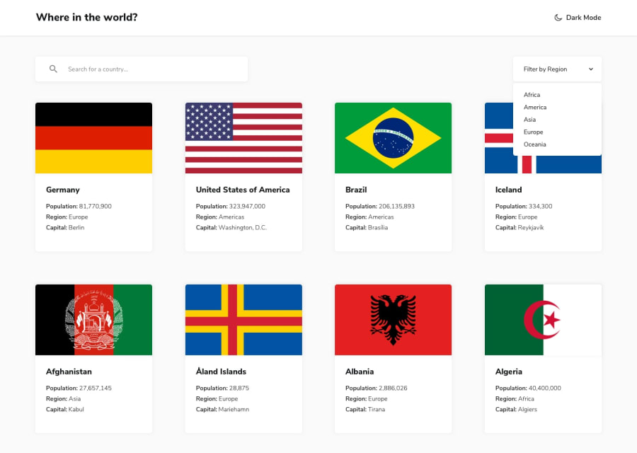
Design comparison
Solution retrospective
hi folks! finished a project that was a bit difficult ,I learned a lot. if you have any suggestion, let me know thanks.
Community feedback
- @seanred360Posted over 2 years ago
Very nice implementation it looks flawless on the outside. Under the hood it looks like your HTML is a mess. If you look below the screenshot section of this page, will will notice you have 253 accessibility issues and 254 html validation issues. You should not ignore this. You have very major problems like <div> tags that are not closed or giving many elements the same ID. Some browsers will not be able to figure out how to display your pages. Thankfully the view report section explains each problem and how to fix it, so it is not a big deal.
Marked as helpful1
Please log in to post a comment
Log in with GitHubJoin our Discord community
Join thousands of Frontend Mentor community members taking the challenges, sharing resources, helping each other, and chatting about all things front-end!
Join our Discord
