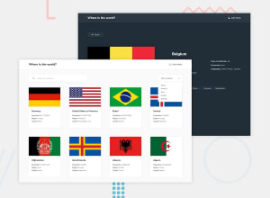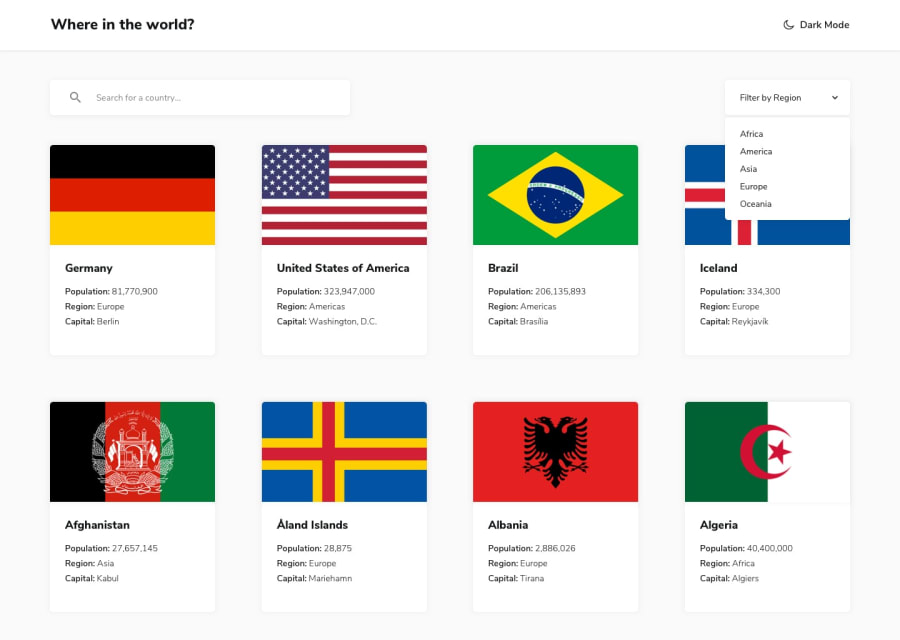
Design comparison
Solution retrospective
Not responsive site.
Community feedback
- @TheHunter597Posted about 2 years ago
Hello there lovely site and great effort just small feedback
1. the filter by region is so small its in width making the words not to appear fully
- you can increase the width to be 20%
- also change the cursor to pointer to make sure the user knows its clickable
2. the main content of the page is overflowing in the X axis
-
first go to the container fluid class and remove height 100vh because you are going to add tens of elements 100vh cant contain them all ,so make make
height:autoor just remove the height entirly as the default value is auto -
now to the fun part remove inline css property that you have assgined to displayCard in index js
<div class="card mt-5 cardID" style="width:21rem">make it<div class="card mt-5 cardID">
after looking at the files I would say you did an amazing job doing this in plain javascript and css I would reccomend you to depend your knowledge regarding scss it will make it easier to maintain your styles with that said have a great day
Marked as helpful1@RanHarushPosted about 2 years ago@TheHunter597 I appreciate your detailed feedback! All of the points you mentioned has been taken care of. Also, in this project I used scss, and yes, it does make easier to maintain that css :)
Again, thank you!
0
Please log in to post a comment
Log in with GitHubJoin our Discord community
Join thousands of Frontend Mentor community members taking the challenges, sharing resources, helping each other, and chatting about all things front-end!
Join our Discord
